google.com, pub-5426958118371358, DIRECT, f08c47fec0942fa0

Shingle Style Meets Northwest

We use affiliate links in our posts and our site. This means if you make a purchase using these links, we may earn a small commission. You don’t pay a cent more than you would otherwise! Our full disclosure is available under About.
I grew up in the building trade.  For fun the family would go look at construction on Saturday afternoons.  Of course when there’s a Street of Dreams, I’m right there, checking out to see what the latest trends are, and if something catches my fancy.   Last month it was a neighborhood in West Linn, a suburb of Portland, Or.
This house is a shingle style house, with lots of architectural features.  My photos may not be the best, but its hard to photograph when you have crowds of people going through the house.  The house was called “Clearhaven” and is by Pahlisch Homes, Inc. and listed as the interior designer is Carin L. Atterbury from Surface Home.  However then I found that Chancellor Designs staged the house for the show with Tiffany Home Furnishings..   I realized I didn’t get enough pictures, so I found some more on Tiffany Home Furnishings facebook page showing pictures taken by Stephen Tamiesie.  There was a professional taking pictures the same time as I was—his are better! I wonder if it was Stephen.

The front has a little bit of everything, style wise. It looks more like a small city than a house.   I had to stand in the walkway and stare to take it all in.  I liked all the covered porches.  It rains ALOT in Portland, so covered porches are nice.

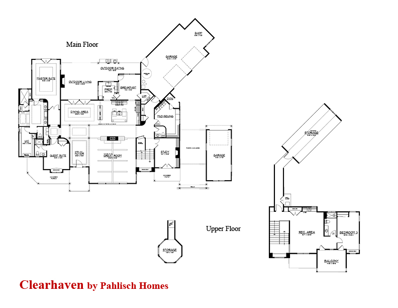
The floor plan is shown here.

THE DINING ROOM

From the entry way, you look directly across into the dining room.

Oh my, the classic lines of the dining room really appeals to me.  I love the wingbacks as captains chairs.   I did that once. In fact, I still have them, recycled to another purpose.  I also like the crystal chandeliers.  The room has a lovely old look with the wainscoting.  The house is filled with fancy ceilings, like the one in the dining room.

 Here you can see a closeup of the sideboard.  I like the tufting on the chairs, but then again, I’ve always liked tufting!  The tablescape was fun too:

Below, the photograph shows the coffered ceiling, and the pass through cabinets to the kitchen.  The little details like the arch make such a difference.

To the right of the entry is the living room:
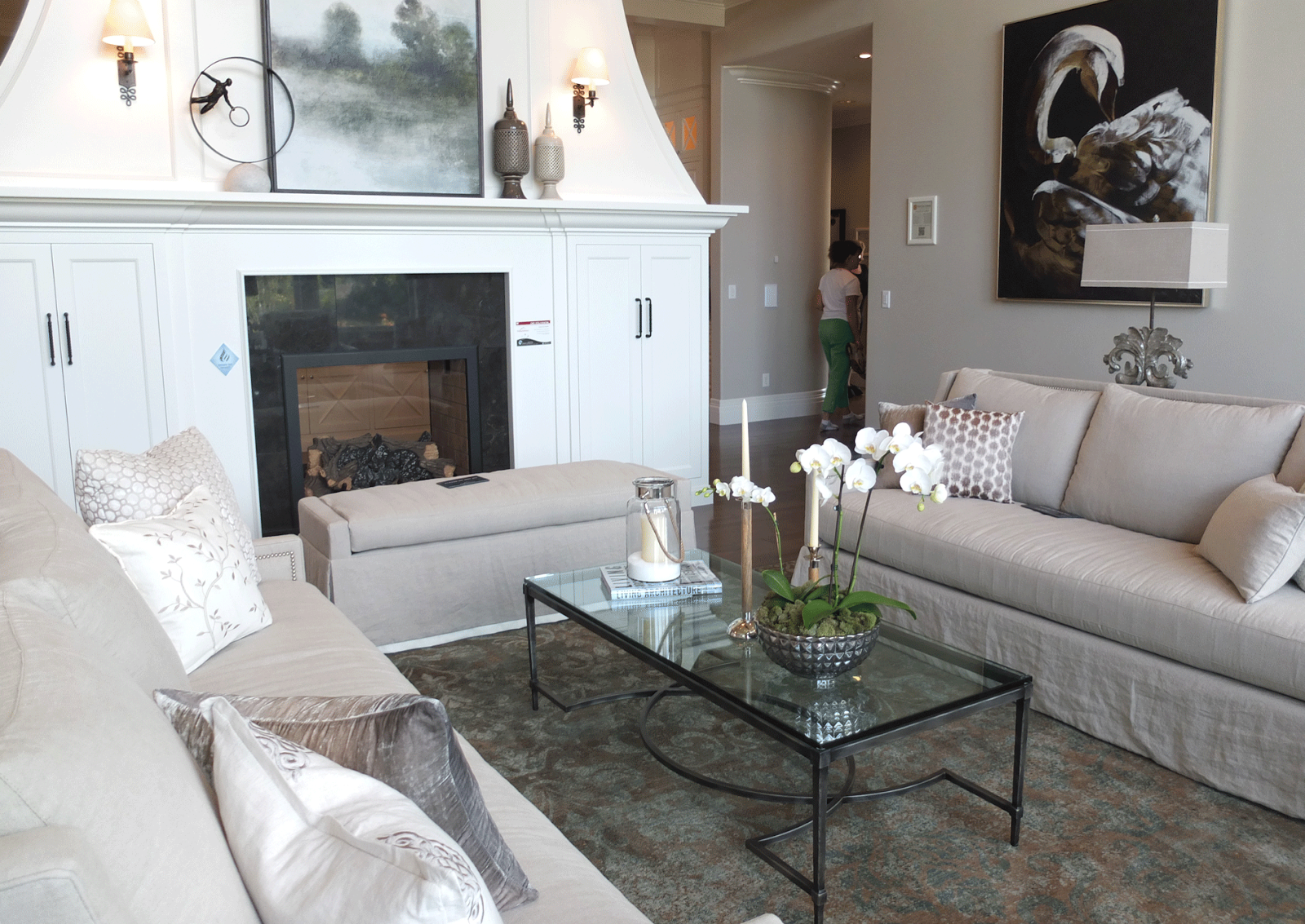
Looking from the entryway towards the windows.  To our left is an interesting fireplace:
Another view showing the chimney piece:
Below is the console underneath the wall mounted TV.
The back of the fireplace:
What do you think of this unusual treatment of a fireplace?  I think I like the shape and the sides.  It really is a beautiful addition to the house.  Notice no TV over the fireplace.  You can see it behind the sofa in the living room in the above photo.  This side of the fireplace is in the kitchen.
The tv is always a problem.  Obviously you can only sit on one side of the room to see it.  That works for me, not being over the fireplace.  The entryway is behind the tv wall.    The sofas, as the dining chairs, are dressed in a simple off-white linen.  I think it works nicely, vs. a more formal fabric.  It is more welcoming, don’t you think?

THE KITCHEN

I need a drumroll please!   This was my favorite kitchen!  I could have just stayed in here.  It was very hard to get photos as everyone else wanted to hang out here too!  Of course, you can never go wrong with white painted cabinets and marble counters.   For trends, I noticed that they did put a pot filler, wow, though, isn’t that a bit high?  Of course someone who doesn’t cook probably doesn’t get an opinion!
I love the x’s on the island cabinet doors.  The other side of the island is too cute too.  Love the cabinet cutout.
To the right is a wall of cabinets:
On this wall you see the microwave, ovens, and Sub-Zero.  Below, you can see to the right of the stove is an alcove breakfast room.  
Below the beadboard wainscoting is dressed up with wide boards.  I like it!
The breakfast room has a pass through from the second kitchen. More on that below.
To the left of the stove is a SECOND room to the kitchen.  I love this room!  It has another dishwasher and farmhouse sink.
Notice the grey stone (marble?) used on the counter.  Of course there’s a farmhouse sink.  I love the arched cutout above the cabinets.
.
Not sure if I like the feet on the cabinets.  I know they are very popular, giving cabinets the feel of furniture. Would they just be dustbunny catchers, or would the maid (me) keep on top of those?! I also like the bracket shelves displaying the white ironstone pitchers.
Notice in the photo above that they added beadboad to the back of these doors.  Isn’t that a great look?  I love it with the crisp black knobs.
Here you can see the windows that may be able to be used as pass-through for outdoor entertaining.  There’s also a window on the right of the sink like this.  Love the “counter-scaping”.  Especially a card for tonight’s menu.  I want that cook!  The simple gray counter is a nice complementary change from the kitchen.

You are looking out onto one of the porches–notice the fireplace echoes the shape of the one in the living room.   I like the seating built in–perfect for parties.  In the picture above, you get a glimpse of the outdoor chandelier.  It looks rusty, which is good in the NW, with 300 days of rain per year.

Of course I have to show you the rest of the outdoor kitchen, since we’re doing the kitchen:
I can only imagine the fun kids would have in this pool.  (The slide reminds me of someone who had one in a hillside like this, and every night they would come home from work and there would be water splashed all over from uninvited guests.  They installed cameras, and found the dogs, I think they were labs, using the pool.  Look for the video on Youtube)
I would like to point out something in composing pictures.  The photo below is one I took.
This one below was taken by Stephen.  Check out how the different angle looks so much better!  He stepped 5 feet to the left of where I was standing.  The tablescape helps.
Of course there is a cute little pool house!  Below, you can see the back of the house with the outdoor kitchen.  In the NW, it has to be covered.   The master bedroom is behind the fireplace wall.

THE MASTER BEDROOM

I thought it was interesting that they chose a bold color for the walls.  I like it, as it sets off the crisp white trim.  Below is a shot of the ceiling.   The wood x’s make it less formal to me, which I like.  
They didn’t have any window treatments, rats.  I’d like to see how they deal with all that light coming into the bedroom.
The master bath has the same cabinets as the kitchen.  The bank of cabinets above are to the left as you walk in the room.  I like all the storage, no open spaces under the counter.  To the right is a tub and a shower.
The tiles are a combination of polished marble and aqua glass tiles.
They created a pattern in the middle of the floor, which is nice relief to all that marble.  I probably would have stuck with a white marble, but that’s ok.  (Who is the nut who put their gross tennis shoes here?)
More photos by Stephen:

Guest Room

At the master wing is also a guest bedroom.  Here is the funky headboard.  
The bathroom has a cabinet like the kitchen, except painted with some pop.  I like the oval window in here.
The vanity is cute, but not sure if I am a fan of open vanities– it’s alot of dusting, but they are very popular right now.  If you cross the entryway, you can see there’s a long hallway that takes you to the rest of the house.

Powder Room

There’s definitely a trend with the open space under the cabinets.  I’d probably put towels stacked, rolled or in baskets.

Laundry Room

Beyond the kitchen is a very cool laundry room.  It has room for a sewing machine which is a big plus in my book.  It also allows room for crafting projects.   
Don’t you love the dutch door?  It’s a perfect spot for that aging dog or puppy when you can’t attend to it’s needs.
The designer’s dog Stella, checking out the new digs.  Isn’t she darling.  From Chancellor Designs facebook.
The rest of the laundry room has lots of storage and work area to the right of the sewing machine area.

The Study

It looks like a Burberry plaid wallpaper.  I’m not a huge fan of the tile around the fireplace, but I do really like the woodwork.

The Staircase

The staircase had black molding and a really nice newel post.  There was a landing with a window seat.
The landing overlooks the living room.
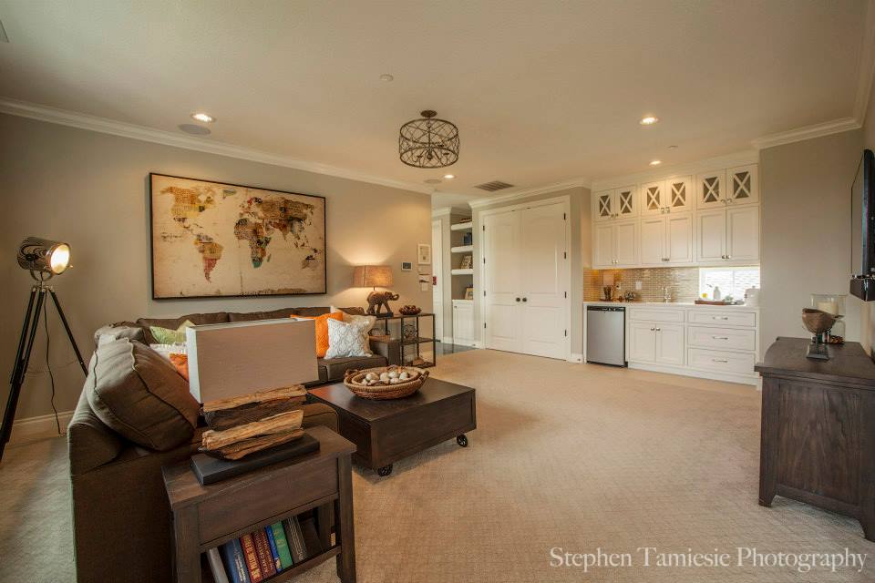
At the top of the stairs was a bonus room, a bedroom and bath.
Even though the entire house was staged just for the show, I really enjoyed walking through and checking out all the furnishings.  This house would be a perfect stage for all my antiques!
Missing from the house was the monster theatre room, open family room to the kitchen, exercise room and a multitude of ugly bedrooms.  Did you miss them?  I didn’t!   4919 SF and only 3 bedrooms.  I really enjoyed this home. I especially remember the hand scraped wood floors and the kitchen.   
I wonder why we don’t have more shingle style houses in the northwest–with all our rain it seems like shingle style is perfect for us.
Follow:

Chelsea Textiles

We use affiliate links in our posts and our site. This means if you make a purchase using these links, we may earn a small commission. You don’t pay a cent more than you would otherwise! Our full disclosure is available under About.

Let’s talk about a wonderful fabric and furniture company called Chelsea Textiles.  I was first introduced to them when I was in the Seattle Design Center in the early 2000s when I stumbled into a beautiful wall of fabrics. Love at first sight!  

Chelsea textiles produces hand embroidered fabrics.  They reproduce designs from the 17th and 18th century in addition to more modern patterns. Let’s enjoy:


 Tree of Life collection in faded moss, above.  Don’t you like the deer in it?  Chelsea Textiles is also known for the check printed fabric, as above on the bench.

 The tree of life with birds, above. I love all of the colors!

Exotic tree collection, above.  I love the one with the elephant!

 These dog needlepoint pillows crack me up.

 A close look at the tree of life pattern, upper left and right. A vine pattern bottom left, and an insect pattern bottom right.


And now for some inspiration at home:


All of the pictures above were taken from Chelsea Textiles website.

 I would LOVE to have some curtains from their fabric.  Someday I also hope to cover some chairs in their beautiful check fabric, like this:


When we were in London last year, we ventured over to the Chelsea Textiles showroom.  It is a short walk from the Harrods in Knightsbridge.  You walk through a beautiful neighborhood that looks like this:


As a souvenir, I hauled this pillow all the way back home, stuffed into my carry-on.  Isn’t it lovely?  I think most people in their twenties wouldn’t be hauling back fancy pillows from London.  

But this… this is a lifetime pillow. 


 Look at the detail on the squirrel! (pictures above are my own)


As you can imagine, hand-embroidered delicate fabric by Chelsea Textiles costs an arm and a leg.  For the tree of life curtains: your first born!!  


Several years ago I purchased the below bedding set from Pottery Barn.  Doesn’t it remind of you of some of the patterns of Chelsea Textiles?


 It appears to be hand woven, but I don’t think it is.  


The bedding pattern was called “Alissa”.  You can still find it on eBay.  I did not take a picture of my own bed because right now I have the summer bedding on… no comforters when it is 100 degrees outside!


Wasn’t that fun?  Did you choose which cushion you would like?  If you ever visit New York or London, visit their showroom!  Or you can continue to drool online.


Follow:

Using Antique Ephemera for Wedding Invitations

We use affiliate links in our posts and our site. This means if you make a purchase using these links, we may earn a small commission. You don’t pay a cent more than you would otherwise! Our full disclosure is available under About.

I have been silent on the web for a reason.  A wedding.   My daughter’s wedding.  She’s a very hard worker as a medical resident and has no time to plan, no time off.  In a previous blog I showed a fabulous “save the date” card.

I have been working on all the details, but as my husband says, spending too much time making every last detail perfect.

First, the wedding invitation has an old German woodcut from 1815. The caption on it is: “Vignette auf einem Dresdener Liebesbriefbogen mit Goldschnitt. Um 1815”. Translated: “Vignette on a Dresden love letter paper with gold trim edges, around 1815.”

The classic one knee proposal, with a couple wearing regency-era attire. This design is actually the “newest” design in the wedding paper ensemble.  (Names blocked out for a little privacy for my daughter.)

It was printed on a 100 year old letterpress using handmade paper made in Portland, Oregon. The invitations were all printed by hand.
Oblation Papers & Press

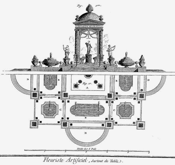
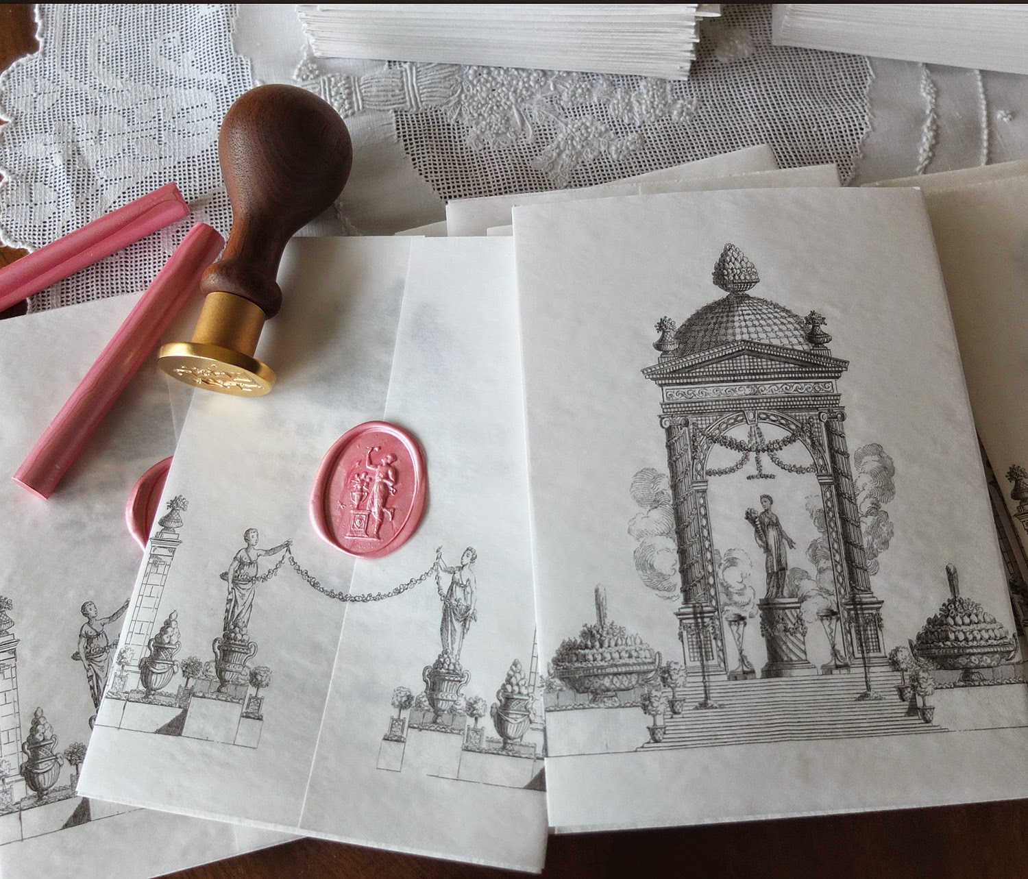
The next thing we wanted was an unusual blotter paper to surround the invitation. For this scene, we found some vintage  watermarked paper and printed it with a french tablescape drawing from 1751.

It came out of an encyclopedia by Diderot. I guess the french really knew how to set up a table for an elaborate feast. Notice how the urns are not plants, they are filled with fruit. We are inviting people to attend a wedding and dinner celebration, so it seemed like the perfect engraving. It also looks like the garden ceremony site. We added the gate posts to that remind us of the garden at the wedding site.

The drawing was modified to act as a tissue blotter, going around the invitation. I wanted to use old parchment paper, which was impossible to find. The modern parchment as a slick, oily texture to it. Instead I used old typing paper – no longer made- with a deckle finish and a watermark. I scoured estate sales and got a stack for $2.

We added the gate posts to make the “back” side with the wax seal more interesting. It is very similar to the garden where the wedding will be.

We then finished it off with a wonderful wax seal of Aphrodite, the greek goddess of love.

The wax was another story. we tried a number of different colors, and settled on a soft pink pearlized wax. It is glue gun wax. You can make the seal ahead of time on Silpat, and then attach with a glue dot.  There are tons of videos on the internet on how to do this.

Lots of practice on the wax seals, these are mostly rejects, some good ones in there though.

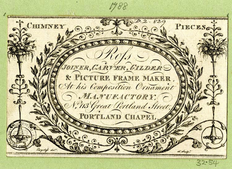
The RSVP card design was from an old trade card from 1788. It is a business card, very elegant, don’t you think? I love the use of the different fonts, and tried to do the same in the items we printed.

The original card is below, from the British Museum.

The Frame Maker business was located in the Portland Chapel (Later known as St. Pauls (1831)) in London, built in 1764, torn down in 1908. The Crown siezed many churches under the Dissolution of Monastaries and Chantries Act, and rented them out as shops, hence the location “Portland Chapel”. My daughter grew up in the “Other Portland”. It seems like a perfect choice!

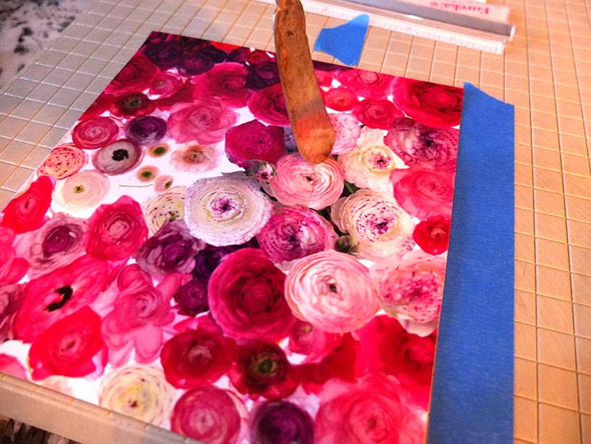
We made our own envelope liner, since we couldn’t find the perfect liner, but it required a lot of work. Below I am scoring the fold line before trimming to fit inside the envelope. I used a paper cutter’s groove lines which worked exactly like the fancy board they try to sell you at Michael’s.

I also used the flowers on the RSVP stamp, but not on the invitation stamp.  I thought that needed a plain stamp.

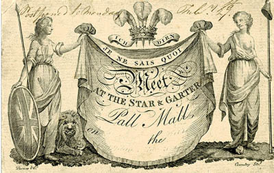
The “frame” on the outer envelope is also an Paris old trade card.  Of course we used a custom stamp design

Here is the original trade card:

The translation of the text is: “Choffard rue des Cordeliers, the first coach entrance on the right coming from the rue de la Comédie Française, at the house of a saddler. A PARIS. Pierre-Phillippe Choffard was an engraver who made his own business card. It is lovely, we couldn’t resist the beautiful ribbon and old roses. Estimated date is 1760-1770.

I spent a lot of time hunting for the perfect fonts to use on the envelopes.  I settled on Burgues Script for the main script.

Then we were off to Bridal Veil on the Columbia River to get their special wedding postmark. It’s a stone’s throw from where my daughter  used to go to summer camp (ok, she would sleep in the barn at the nun’s house, they called it camp).

Now I am waiting for the RSVP’s to roll in.  Given the tremendous amount of work I put into this, I hope everyone enjoys receiving it. A good friend called and said she wouldn’t be returning the RSVP, it was far to pretty and she had to keep it, would I mind? I am happy that someone thinks it is a treat to receive something so special!  I know for sure my daughter appreciates it too.  That makes me happy that she is delighted.

Off to worrying about other details….
Follow:

1788 Invitation from an Ephemera Collection

We use affiliate links in our posts and our site. This means if you make a purchase using these links, we may earn a small commission. You don’t pay a cent more than you would otherwise! Our full disclosure is available under About.

I am in the midst of planning my daughter’s wedding.  Being the collector of everything antique, I really wanted something unusual for her wedding announcements.  I’ve started out by using an old invitation from 1788 for her “save the date” card.

When I first heard the word “ephemera”, I didn’t really know what it meant.  I had to look it up–it means documents that are intended to be thrown away after use.   I am so glad that ephemera has survived.  There are people who collect all kinds of ephemera.  I seem to be drawn to the English trade cards used in the 1700’s. However, trade cards really weren’t large enough to adapt to this use, so this card seemed to be a perfect starting point.

 The card was tough to clean up, took me hours. However I did work on it, and then I modified it to match the couple, and appropriateness for the SAVE THE DATE announcement.

The end result below. I tried to block out some information so my poor family can have some privacy.

If you are on the hunt for announcements, there are tons of options available to you thanks to the internet.  You can find many things on Etsy, but I had an idea and I couldn’t find anything that satisfied me.

I wanted a colorful envelope liner, but didn’t want a plain color.   The photoshopped flowers below reflect the joyful excitement I feel about the wedding.  I also love the juxtaposition of the old graphic against the colorful flowers.  So I to a photograph and made color copies, cut and glued them in myself.  You can find Martha Stewart Youtube how-to instructions.

The envelope liners look great!

Below I made a custom flap for the envelope.  The rabbits in the invitation are a whimsical touch, because we live on “the bunny farm” according to my daughter.  We’re overrun with jack rabbits, and you can always see a half dozen when you look outside. The shield has an early german woodcut of a couple in the regency style known as “the proposal”.

I love the pop of the colored liners against the black and white print. The letterpress work really looks nice.  It made a beautiful flap on the envelope, and the card was superb.

Below is a sample of an envelope using computer calligraphy.

The address above is fake, but thought you’d like to see the beautiful script I purchased online.  I decided to cut cost by printing the envelopes myself, and they look GREAT!   I am very happy with the printing, it is hard to tell that it is not calligraphy, which can easily cost $4 each.  The custom stamp matches the envelope liner.
OK, now I’m happy!  Feel free to email me if you have any questions about the project.   I’ve been working on this for a few months and am happy to check something off the list.  I toyed with edging the announcement in a fuchsia pink.  We decided against it, thinking it would be just a bit too modern.  The reaction from the recipients has been great.   My brother said that the postman hand carried his to the front door to make sure he got his beautiful envelope!

The next project is the invitation.  It is even more awesome — everyone expects it to outdo this card.   I must find a DL or monarch size envelope.  Ideally I need an 7.5″ x 3.75″ card.  I can find the envelope, but I’m out of luck getting an inner AND outer envelope.   Help!   Anyone have any suggestions?

Follow:

Antique Teapot Flower Arrangements at a Wedding

We use affiliate links in our posts and our site. This means if you make a purchase using these links, we may earn a small commission. You don’t pay a cent more than you would otherwise! Our full disclosure is available under About.

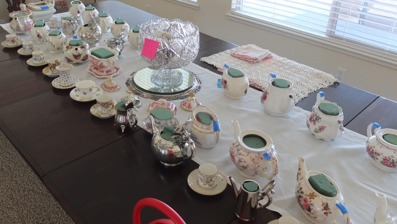
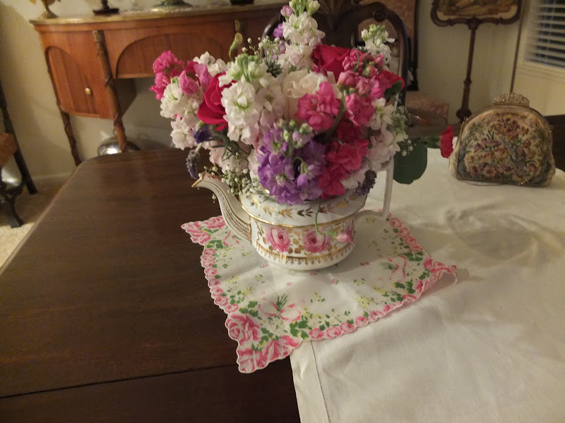
This project has been a long time in the making.  My niece came up with the idea of using antique teapots for her flower arrangements at her wedding reception.  This of course had to involve me because who else would she go to but her obsessive antique-collecting aunt?    We didn’t use antiques entirely (although we probably could have), because she was panicked at the value of some of the teapots.   So we had alot of fun last spring keeping an eye out on eBay for things that would go with her wedding colors.  That was after hitting up my collection for teapots that went with pink.   The head table used silver pots, creamers and individual pots, along with some demitasse.    She also wanted to use some antique linen underneath the teapots, but given the white tablecloths, we decided to use antique print hankies that matched the teapots.

I was so busy with the project, that I didn’t take alot of photos, but thought I would share with you what I did take along the way.

I had done some trial arrangements and found that loose flower arrangements wouldn’t hold their shape or transport (130 miles) well, so I had to use frogs or oasis.  We used hot glue to secure the oasis into the pots, although it was difficult on some because of their size or shape.  In those cases I tried to wedge the oasis in by cutting a piece larger than the opening, cramming it in, and cutting a v-groove so I could be able to put water in the pot.

Teapots filled with Oasis a week before the wedding.

I picked up the roses 2 days before the wedding in order to let them open up beforehand.  There’s nothing worse than flower arrangements that just have tight buds.   This worked well for all the roses except one bunch, which were blown by the wedding morning.

The colors on this rose was absolutely perfect.  Unfortunately They didn’t hold up.  I kept them in the refrigerator til the wedding.   I was hoping….

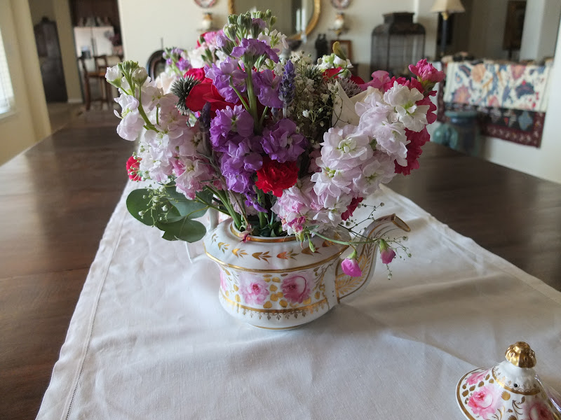
My niece wanted old-fashioned flowers and requested that I used baby carnations.   I do love the spicy fragrance they have.  Other flowers were used included: stocks, sweet peas, sweetheart roses, spray roses, David Austin roses, snapdragon, echinops, and lavender.

Oh my!  So many flowers, so little time!

Overall, everything held up well.  A few problems were —
 – The dark fuchsia stocks did not hold up well and were wilting hours after I brought them home.  I was 40 miles from my supplier and couldn’t run and replace them.  I cut the bunches off very short in order to let them perk up while using.
 – I should have picked up the carnations 2 days before too, they were a bit to tight for me.
 – The sweet pea stems were pretty fragile.  I would put them in first just so I could carefully maneuver them into the arrangements.  I had purchased them in selected bunches of color.  I would not recommend using them unless you literally grow them yourselves.  Half were blown by today, they were the only thing that drooped in some of the arrangements.
 – The lavender wasn’t the standard augustafolia variety.  I don’t know what kind they were, but I literally didn’t have time to run out to my garden and harvest some for use.  As it was, all the David Austins came from my yard.  Make that yards.  I flew to California on Thursday and had carried flowers from the Washington house on the plane.

Oddly, the Cecil Brunner roses turned white in the fridge, but The Fairy, and the Geoff Hamilton roses held up well.  I needed miniature roses for the cake.

A cell phone progress picture…. Are those photo-bombers in the background?
These were many varieties of roses in a teacup my niece would love.
I made this thinking I might wind up needing “extras” somewhere.
This was a 250 year old bat-printed teapot. The tape on the handle corresponds to a number on a hanky that gets placed under the teapot.
You can see my reflection in this chased silver teapot that is designated for the head table.
The head table is 4 feet longer than I had originally planned.  I didn’t have enough silver teapots, so I used these Royal Worcester demitasse in between each silver item.   The roses for my garden were used here.

I used plastic stacking bins to transport the 31 arrangements in a minivan.  That was great because I didn’t have to worry about water spilling.   I used bubble wrap between the teapots, most bins had 2 or 3 teapots based on the size  of the teapots.  London shape teapots could fit 3 to a bin.

A set table, teapot, vintage hanky, and all the “stuff”.
I don’t like the table numbers poked in the arrangements.  If I’d had time, I would have taken them out and just tented them next to the teapots.

Where the bride & groom sat.  I wanted low arrangements in front of them to not block their view.

The entire long table.  The flowers really added color and made it festive.  We added some swags to the front of the table from pew decorations.  I didn’t like the stage.  The brown curtains were ugly, other than that the room was nice. The bridal party was completely unapproachable.  I would have put them on a round table down on the floor, but maybe they didn’t want to be disturbed.

A bullion cup was used at the top of the cake.  It was really cute!

I had brought about 80 roses for rose petal use.  I did not do this table.   When I turned around, the cake table was done, the bag of roses disappeared, and there was just a few skimpy petals on the table.    Note to self:   If you want something done right, you have to do it yourself. This looks like an accident on the table.

The setup time was weird.  We had one hour before the wedding to do everything, from the tablecloths to finish.  It was supposed to be an hour and a half.  I was supposed to put certain antiques on certain tables, but there were only tea names on the tables, and I was supposed to put number on the table.  The diagram I was given didn’t have any numbers on it.   I am not a fan of weird table names.  Really, you are making it hard on your setup team doing something like this.  A few minutes before the wedding my sister came in with a box of stuff for setup.  I wound up missing the wedding.   I was working so hard I didn’t even know where the church was in the complex.  I’m not happy that I missed her walking down the aisle.  Not only did I miss it once, I missed it twice.  The bride’s sister is ill and was admitted to the hospital wednesday before the wedding.  Apparently the legal wedding took place at the hospital and because I was doing the flowers, I missed it.  Other family members were there but I didn’t know that was the official ceremony.    Everyone says that was the emotional wedding.  I think I’m more upset that I wasn’t considered important enough to go to the “official” wedding. Or maybe am I upset that it didn’t bother anyone that I wasn’t there?    I’m feeling like the hired help. Missing her wedding(s) has left me very upset.   I hope she appreciated my efforts, I really tried to make it beautiful.    Just remember, if you take on a project like this, you will work day and night before the wedding.  The florist is worth every penny!

I think this is my favorite teapot.  It is circa 1820’s

This is what it looked like with a print hanky under it.

These are some of the other hankies used.  They went with specific teapots based on color.  Antique bags that got used are in the background.
This cute little thing lost a few flowers in transport,
and the oasis moved around. Isn’t it darling!

I am exhausted, I now have a sore throat and earache.   I have some flower arrangements to clean up.  After I throw out all the flowers, I’ll harvest my lavender for the season, close up the house, and go where it isn’t 108 degrees.  It’s probably raining in Washington…  I’ll  chill out and realize that families are families.  We stick together through everything, including when slighted relatives are not included to attend a niece’s official wedding ceremony.

My daughter’s wedding is next May.  Here’s a peek at what I am working on:

A card from the 1700’s!

Her wedding will not start until I’m seated and that’s final.  No, I’m not doing the flowers.  We asked her to elope yesterday.  She said no.

Follow:

French Wire Hamper on Wheels!

We use affiliate links in our posts and our site. This means if you make a purchase using these links, we may earn a small commission. You don’t pay a cent more than you would otherwise! Our full disclosure is available under About.

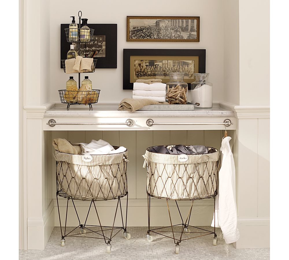
Ever look for a stylish hamper and get tired of all the baskets?    Yesterday I stopped by Pottery Barn with my husband.  We were really just goofing off, killing time before lunch.  I spotted the cutest hamper ever and had to have it…. I like to use vintage wicker laundry baskets for clean clothes, but I’ve never seen anything with wheels!

Photo from Pottery Barn website.  

I only bought one, but I love it!  You know I always want to have new things that look old.  The Crate and Barrel might seem more functional given the narrow shape, but this one is really nice because you don’t have to bend over to empty it.  They only had one color liner, but I bought it anyway, thinking it would be easier to use it as a pattern if I wanted to redecorate.  You can get the porcelain tags that say “lights”, etc.  but I only purchased one, so I didn’t need the tag.

The only thing I didn’t like about it is that it looks like rusty wire.  I like the look, it’s just not that functional–don’t put damp clothes in it.  The really cool part is–the basket collapses flat!   I thought I’d share, as PB always seems to place one-time orders and when it’s gone, you’re out of luck.

I saw this hamper at Crate and Barrel‘s website.

It’s function, and you could roll it down the hallway if you’re like me and do 3 loads at once.  I hated those cheap looking plastic wheels and it just doesn’t have the charm of my new one!

Follow:

Antique Show Find – Antique Mirror

We use affiliate links in our posts and our site. This means if you make a purchase using these links, we may earn a small commission. You don’t pay a cent more than you would otherwise! Our full disclosure is available under About.

A few weeks ago I attended several antique shows, Hillsborough  – Bay Area, Expo – Portland, Or.

I’ve written in the past about my love of antique mirrors.  This mirror caught my eye because of the pale robin’s egg blue in the reverse painting of swagged roses–and the swagged roses.   The frame is in good shape, the mirror may have been replaced at the turn of the century or later, but it does show signs of age to be an authentic tabernacle mirror from the early 1800’s

I did find a few pieces of french monogrammed linen for a song.  (I so periodically sell on Ebay, but am on hiatus until this whole move thing gets settled).

I will share my other finds as I have time to write.  Enjoy!

Follow:

Favorite Collections: Antique Mirrors

We use affiliate links in our posts and our site. This means if you make a purchase using these links, we may earn a small commission. You don’t pay a cent more than you would otherwise! Our full disclosure is available under About.

I’ve spent many years collecting antiques, and many of my friends, especially those who are 60’s plus, passionately collect a specific arena of antiques.  There are die-hard collectors who have PATHS through their house, with so many boxes of depression glass, figurines, staffordshire (one had over 350 dogs alone!).  They don’t necessarily have all junk, some have hundreds of thousands invested.

A lesson learned in 30 years is that I am attracted to antiques that contribute to the ambiance of my home, and I become frustrated when I become OCD over a particular genre.  I had over 400 pieces of American Brilliant Cut Glass.    I finally realized I don’t like cabinets loaded with “things”, I prefer to create vignettes around the house.  So I  called Jason at Woody Auction, and he picked it up and sold it.  I’ll blog about ABCG later.

The best advice ever given to me was:  educate yourself about a particular field,  collect 5 to 7 items in that field, and move on.  Everyone says buy the best you can afford, in the best condition, with no or minimal restoration.  I have to say, while I preach that too, I don’t follow it.  Educate yourself, and if you see an item in poor condition, for 10 cents on the dollar, go ahead and buy it.  Place it in your house, and decide if you want to continue to collect.   Everyone tells you to buy from reputable dealers, but often they will pass up a piece in poor condition because it doesn’t meet their criteria.    If you’re willing to pay $79 for a table at Ikea, who cares if that cute french table has a cracked and reglued leg/ or top?  I’d rather have the $79 french table!

Tthe next time you’re visiting your favorite dealer, tell them you to call you if they find a beat up period piece of furniture. Those dealers have the contacts and have the ability to look out for things for you.  PLUS, they will also tell you that there’s been a major repair, where others may not….

It is easy to decorate with antiques and be successful–the pieces are interesting, have some patina, and even the most modern room needs an antique object in it to give it some depth.   It is NOT easy to decorate and pull together a room if you are not a decorator or designer.  For those of us who collect antiques, people always love our homes.   The reaction is very gratifying–friends love all my treasures as much as my husband and I do!  Even though I’ve helped friends out, I think my success lies in using antiques.  I don’t consider myself to be a good decorator, I just have an eye for antiques.

Antique Mirrors
I’ve always liked mirrors.  Living in the Northwest,  daylight is an issue.  We only have 60 sunny days a year, and mirrors reflect light in the home.   I find little mirrors very interesting.   There are 3 mirrors in my dining room.  They are all different.  The mirrors on each side of the breakfront are lovely. The one on the left is a tabernacle mirror, with a reverse-painted scene.

These reverse painted mirrors are hard to find in good condition. This one is too sweet for words!

The shield shaped mirror may be the oldest mirror I have.  I tend to have a weakness for anything with an eagle on it.   This mirror is interesting, the chain that you see on the front is actually the original chain that this should have been hung with.  If you are wondering what a 200 year old mirror should look like–check this one out!

The eagle below is FROM a mirror.  See, I can’t resist!

The third mirror is a typical large Victorian mirror.   You can sometimes find them with console type tables.  This one is sweet because of the grapes carved in the frame.  I have it in the dining room so guests sitting with their back to the view can see the view in the large mirror.

Dining room, reflecting view

The view is great, don’t you think!  A great sumer day with sailboats on the Columbia River.

I was in a model home and liked the two mirrors that were used in this dining room to reflect light and make the room seem larger.  Of course I don’t like the frames, but it really was pleasing to view from the entry way.

 I would love to have a pair of mirrors from Restoration Hardware instead.  They are massive and wonderful!

However, I have my share of tiny and wonderful.  The great part about tiny is that you can move them without breaking your back.

The above reverse painted mirror was an accidental purchase.  I was just checking out an online auction through liveauctioneers, and thought I’d “test” the bidding process.  I clicked “bid” on the starting price–and got it.  It was from Skinner, and I think I got it for around $150 including shipping!

There are many mirrors with gilded frames. Here are a couple of my favorites:

 The one below I plan on taking to our country house to hang on the limestone fireplace.  It is quite small, I’d guess only about 26″ tall.   This mirror gets the award for being so “over the top” with it’s carved roses.  It’s appropriate to be moved–we just planted over 100 roses there…

I totally love this mirror!    I suspect that the mirror may have been monkeyed with, but there isn’t too much damage to the gesso and carved wood roses.  The reason I think something has been done to it is the crest is a bit of a different color.  It matches the carving, but has someone refinished the rest of it?

 There mirror above is in the guest room.  I have some great Schumacher wallpaper that I put up in 1986.  I hate to “update” this room–I still love the wallpaper.  It from the Abby Aldrich Rockefeller Folk Art collection, a copy of a vintage velvet ribbon, as I recall.

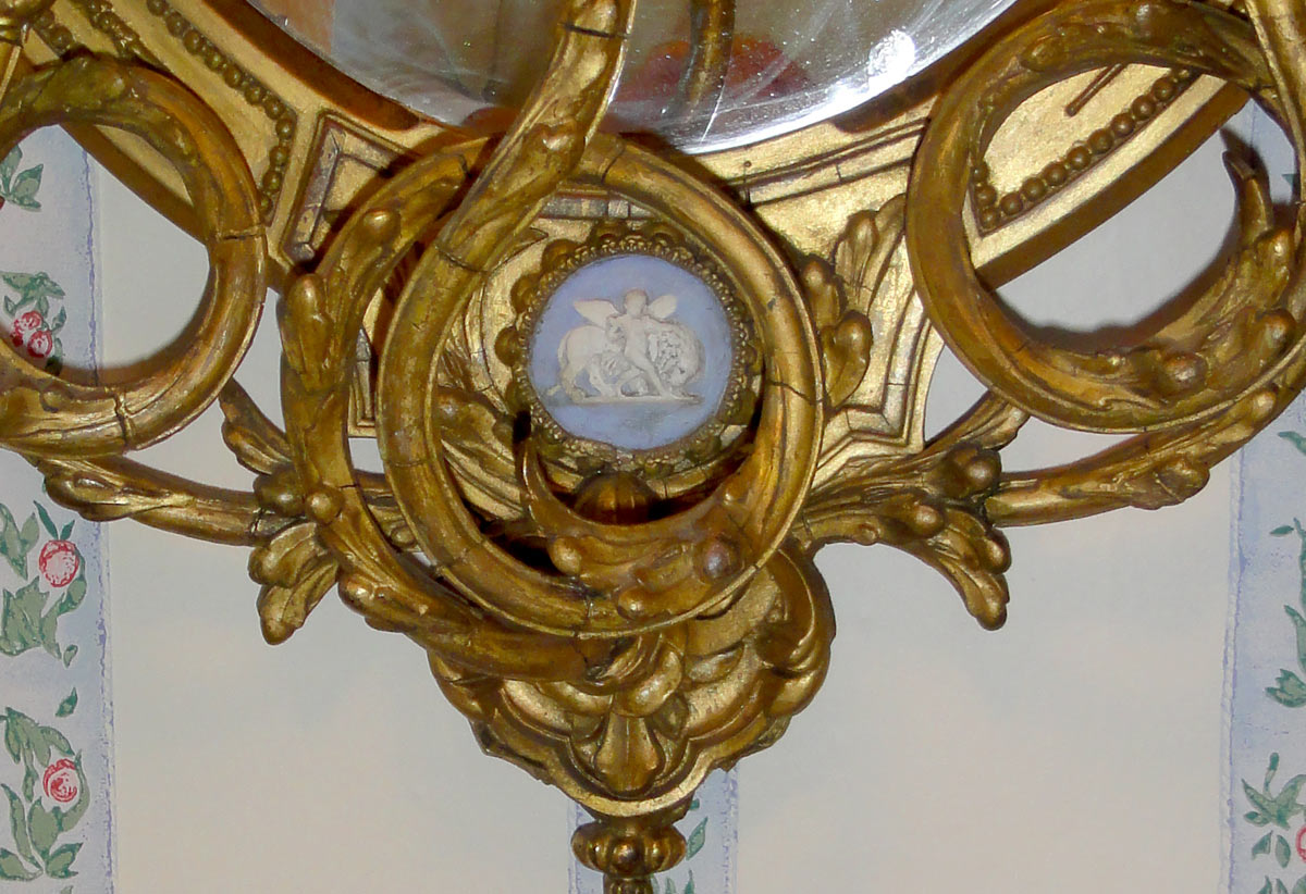
This mirror has wonderful original wooden candelabra, I love the way they twist with you being able to view the jasper medallion through the center one.  It is quite a neoclassic theme.  Usually when I think of attached candelabra, I think of bullseye or convex mirrors.  I have a reproduction mirror, no candelabra though.  I got tired of waiting for an antique, and I thought it would be fun to get an extremely large mirror to reflect the entire room back at you.

I need to be a good blogger and dig out the inspiration photo for this one..

Another interesting mirror is a reproduction that Barbara Barry did for Baker Furniture.  It is a very deep frame, but I didn’t like the $1600 price tag.  Also, the one I saw in person had the frame a very dark ebony.  This looks walnut to me.   I recognized this as a reproduction of an antique.   They tend to show up on Ebay, and you can pick them up for around $150. if you keep an eye out.  Of course you would need to cut a mirror for it.  I picked one up about 4 years ago, and it’s still sitting in my “project” closet.

The next mirror,also a reproduction, is in my powder room.  I had planned on keeping an antique cabinet in the remodel, but the old cabinet had the marble glued to the top and it literally didn’t survive the attempts to use it.   Unfortunately it was short notice and I had one day to hunt for a new cabinet.  It was tough and I had to settle for the cabinet below–we didn’t have Williams Sonoma, Pottery Barn, or Restoration Hardware back then.  I did manage to pick a nice grey blue wall color, which looks fresh today.  I’m not thrilled with the candlesticks, but there you have it.  Sometimes it takes me years to get something right.

I have another reproduction mirror, this one from my Baker triple dresser.   I’ve always liked the mirror, but I really love the fabulous antique Imari urns that I have on the antique French brackets.

The reproduction French mirror was picked by my daughter, she had the foresight to go with this wonderful painted finish which is fabulous in her living room.

The mirror is huge and makes a great statement in the room.  She’s in college, so she has a few cast off items.  Not bad for a poor college student!  It beats my first living room with cardboard boxes and tablecloths on them.  She just got a large wicker basket for all of her blankets (Restoration Hardware, she reads Joni at Cote de Texas).  I think she has about as many blankets as I have mirrors….

The above Biedermeier mirror was at Clark Graves in Saint Louis.  I debated about it, and by the time I made up my mind that I had a spot for it, it was gone.  Sigh.  It is different from the rest in the collection.

Here’s my favorite formal dining room.  I love the green walls with the mahogany breakfront.  The mirror reflects the beautiful drapes made out of a chintz by Mario Buatta.  I had decided I wanted some more years later after I made these.  I called Mario’s office in NY, thinking that I would have a staff person answer the phone.  HE ANSWERED THE PHONE!!!  Anyway, he was very gracious, and I was sooo delighted to talk to him!

Back to the mirror:  I picked this massive mirror up at an estate sale.  It was a mess.  I’ve actually antiqued the gilding, because someone else had done the same and ruined the old finish.  The wood on the back of the frame weighted a ton, and was in pieces in a box.  I managed to get it for $50.  It looks fabulous with the Williamsburg sideboard by Baker.  I am not a purist, I will buy reproductions.  Antique isn’t always better when you’re looking for function.  My husband has a pet peeve of stuck antique drawers…..  I love the oval mirror over the oval bowfront sideboard.

I don’t limit mirror collecting to wall mirrors.  Keep an eye out on Ebay, there are many wonderful hand mirrors out there.  The repousse work is incredible.  Check out my fabulous linen too.  I love this piece!

  Plateaus are a great way to reflect light into a piece of glass.  This is my favorite plateau (sitting on a fabulous 19th century handmade figural Italian Pt. de Venise lace cloth.

I just picked up this mirror for my dressing table in the other house.  It’s very charming and petite.  I would guess it is half the size of any other shaving mirrors I owned.  There’s nothing like old mirrors to soften the wrinkles when you pass the big 5-0.
 
I have a pair of these mirrors.  I think they will look great on each side of our bed over the nightstands.  They are circa 1830’s, featured in an old “The Magazine Antiques”.  I need to find some fabulous lamps.  I will take my time this time!

My last purchase was this mirror above.  I thought it looked really great in the antique shop.   I was planning on putting it over a Georgian chest, but the scale was all wrong. Now I’m not happy, because I can’t find a home for it.  I especially like the little tassel carved and painted below center.  The carving is quite heavy and ornate.  What do you think of this mirror?

My dear friend Beverly had this antique mirror in her house.  It is a courting mirror, and she was so delighted to finally add it to her collection. Isn’t it adorable!  My husband didn’t like it so I didn’t bid on this at her estate sale.  Wow, am I sorry I didn’t just go for it!!

I hope you’ve enjoyed my parade of mirrors.  I went over the 5-7 item limit, but I will plead my case, I have alot of square footage to deal with.What do you think about using antique mirrors?
Follow:

From the Shop

I may earn a small commission if you purchase with these links

no products
Please note that I use ShopSense, LIKETOKNOW.it, Shareasale and Amazon affiliate links on this site. This means using them for purchases won’t cost you extra but may earn me a small commission.  Our full disclosure is available for viewing under About in the disclosure policy.
All rights reserved. Our graphics, images and text are all subject to copyright protection.