Doc Martens back in style?!

We use affiliate links in our posts and our site. This means if you make a purchase using these links, we may earn a small commission. You don’t pay a cent more than you would otherwise! Our full disclosure is available under About.

First Birkenstocks… now Doc Martens?!

I was at Nordstrom’s last week and ran into a whole display of… Doc Martens boots.  Huh?!  I thought those went away with the 1990s!  Well, they’re back.

Now I am a child of the 90s.  I also grew up in the Northwest.  Dr. Martens were a staple to have in your wardrobe.  It was coincidental that Doc Martens were highly popular during the rise of the Grunge movement out of the Northwest.  I assure you as a grade-schooler I did not know about Nirvana and Green Day.  They are also very practical shoes to wear in a place where it rains all of the time.  No wet socks for me! 

Company history first… because I think it is interesting.

Dr. Martens is a British brand, founded by Klaus Martens.  He was a German Army doctor who injured his ankle while skiing in the Alps.  The regular German army boot hurt his foot, so he designed a new boot with soft soles made from discarded rubber from the Luftwaffe (German air force).  The German housewives loved how soft and comfortable his shoes were, and 80% of his boot sales were to women.  His company was bought out by a British shoe Manufacturer in 1959.  The rest is history.

Let’s take a look at a selection of their shoes:

“Brielle” Boot, this is a new look to me.  I think this boot would be rather nice to have if you lived somewhere that had a lot of snow.  
‘Mary Jane’.  A classic.  I had a pair of these once.  They were nice.

classic oxfords.  I had a pair of these at some point as well.

An original, the ‘Pascal’ boot.  I always thought this looked like an army boot… didn’t know it was designed as an actual Army boot until today.  Go figure!  
‘8053’.  This was the last part of Dr. Marten’s that I owned.  When I went off to college and was walking a few miles a day, the weight of the shoe really started to hurt my bad knee.  And that was the end of Dr. Marten’s for me.
‘Hackney’ Boot.  I tried these on at Nordstrom.  The smaller sole on them is really nice; it makes for a light weight boot.  If I were to purchase another pair of Dr. Marten’s, it would be one like this with the thinner sole.   I can’t wear heavy shoes anymore!  

They don’t make these anymore.  This is what I would wear in the Summers.  With socks, of course!  

Jessica Alba wearing the Dr. Marten’s boots

While they may be in again, I don’t think I’ll be joining this trend.  While the shoes are comfortable, they weigh too much and make my knees hurt.  Sucks getting old.

Here are some of my favorites:


This post contains affiliate links.

Follow:

Mackenzie-Childs DIY napkin rings

We use affiliate links in our posts and our site. This means if you make a purchase using these links, we may earn a small commission. You don’t pay a cent more than you would otherwise! Our full disclosure is available under About.

Mackenzie-Childs DIY Napkin Rings!

I love Mackenzie-Childs.  But my budget does not.  So, I came up with an idea to get the look for less.  I have been wanting these napkin rings below for a while:

Mackenzie-Childs Courtly Check Napkin Ring

But at $16 each they are a little out of my price range right now.  So I came up with the idea of making my own.

Materials

  • Mackenzie-Childs Ribbon (you may it purchase here).  I purchased the 1″ ribbon for $28 for 10 yards.  There are larger sizes if you would like to use that instead.
  • Another napking ring for size
  • scissors
  • needle and thread
1″ Courtly Check ribbon

 STEP 1:
Wrap the ribbon around another napking ring for proper sizing.

step 1.

 STEP 2:  Give yourself extra overlap so the ribbon will not unravel.  Then bend back the ribbon ends so a nice seam is left.

STEP 3:
Sew the overlapping edges over each other with a simple running stitch by hand.  Then VOILA! done!

Finished product next to the old napkin ring for size.  Notice how the ribbon edge on the inside of the napkin ring is folded over so the ribbon will not unravel.

 Coincidentally, the Courtly Check napkin rings match my old Mary Engelbreit pin cushion!

The finished product! Not too shabby!

While the normal napkin rings would be nicer, the project cost was $28 (I made only eight of the napkin rings, but you could make a whole bunch more) vs at least $128 for eight real napkin rings.  I get the look, for 80% off the price, which is what I wanted.  Plus I have at least 9 yards of Mackenzie Childs ribbon to play with!  Now what to do with the extra ribbon… I’m sure I’ll think of something!

I’ve linked up with The Scoop! Visit Confessions of a Plate Addict blog, it’s a good one!
I’ve also linked up with Wow us Wednesdays! at Savvy Southern Style, Open House Party at no minimalist here, and Feathered Nest Friday at French Country Cottage!

Follow:

Taking Antique Prints and Framing them

We use affiliate links in our posts and our site. This means if you make a purchase using these links, we may earn a small commission. You don’t pay a cent more than you would otherwise! Our full disclosure is available under About.

I have on my hanging on my wall a series of 16 reproduction prints of antique German landscapes.  Below I have them arranged around my tv.  In my previous apartment I had a nice big wall where I had them lined up 4 by 4.  It looked fantastic. (And of course I can’t find a picture).

My repro German prints from the 17th century!

A close up.

Anyone who comes over always comments on them.  They are from Williams-Sonoma Home, from the physical store itself when they were still around.  I found them on the clearance table.  The prints were stacked up in a little box for less than $100.  The frames were purchased on amazon.  For the amount of impact I get from them, it was really a good “bang for your buck” deal.  

Now for some information about them:

They are from a work entitled Der Fruchtbringenden Gesellschaft Nahmen, Vorhaben Gemaehide und Woerter.  It was originally published in Frankfurt, Germany in 1646 as a manual produced from an old German society, Die Fruchtbringende Gesellschaft, that sought to improve human virtues and to purify and improve the German language.  Each print contains a flower with a background of a German town, garden, or countryside.  They were 

Below are some pictures of the original plates, in closer detail.  I figured I would show close ups of these prints instead of mine exactly… trying to take a close up picture a picture can prove difficult.

Entitled “Red Flower”.  I have a copy of this print hanging.

This one is called “Tree”

This is the “walnut tree”. I wish I had this one!

This one the “potato”! I wish I had a copy of this one too, as I am a potato lover!

I have a copy of this one hanging, “blue flower”.

 Have you ever seen anything like these?  I’ve yet to run across them anywhere.  It actually took me a year to figure out what they were exactly.  I found the information on them here

I’ve linked up with The Scoop! Visit Confessions of a Plate Addict blog, it’s a good one!
I’ve also linked up with Wow us Wednesdays! at Savvy Southern Style, Open House Party at no minimalist here, and Feathered Nest Friday at French Country Cottage!

Follow:

Birkenstocks on Vogue?!

We use affiliate links in our posts and our site. This means if you make a purchase using these links, we may earn a small commission. You don’t pay a cent more than you would otherwise! Our full disclosure is available under About.

Vogue blog features Birkenstocks? Did I read that right?

Never would I have thought I would have heard the word Birkenstocks and Vogue used in the same sentence!  They featured a piece on their blog not too long about, talking about how Birkenstocks are in fashion.  Huh?

Now, I grew up in the Pacific Northwest.  This is a staple shoe in the Pacific Northwest.  But… this is how us Oregonians/Washingtonians wear this shoe:

Sock with sandals shoe offender! Must live in Oregon…

Trying to style socks with sandals… still doesn’t work!

 But… socks with sandals? That’s a huge fashion faux pas!  Well, I’ll tell you why. It’s COLD. That’s why.  When you live in a place that’s cloudy 300 days a year, socks are a must. Even with sandals.

Well Vogue says they’re cool. So we can all go buy this hippie dippy German shoe.  Look! A supermodel is wearing them all over L.A. in July of this year! So they must be cool, right?  Yes, Heidi Klum is extremely fashionable. But she’s German!  Of course she will wear the German sandal.  She probably has wide German feet.. like me! like my whole family! 

She’s super fashionable, wearing Birkenstocks in LA!

Did you know Heidi Klum also designs for Birkenstock?  Does that also change your opinion of how trendy they are?

I will say though, they *are* comfortable.  I may be guilty of owning a pair and wearing them with socks… in the 1990s.

The classic Arizona sandal

 Nah. still think they aren’t very cute.  But, they ARE comfortable.  If I had to go on a trek in sandals, I would buy a pair of them.

Actually though, I do work in a hospital… these ‘Boston’ clogs look pretty comfortable.  I actually might consider a pair…  my Dansko’s have been causing my old knee injury to hurt recently because of their weight.

Boston clogs

 Next time I go to Nordstrom’s… maybe I’ll try a pair on.  After all, they’re trendy now. Says who? Says Vogue.

Here are some of my favorites…


This post contains affiliate links.

EDIT 5/19/15- While I wrote this post 2 years ago, the Wall Street Journal is just *now* posting about how trending this shoe is.  Check out the article here: Trendy Birkenstocks 

Follow:

Mixed Berry Scones

We use affiliate links in our posts and our site. This means if you make a purchase using these links, we may earn a small commission. You don’t pay a cent more than you would otherwise! Our full disclosure is available under About.

Mixed Berry Scones

I love scones.  I have tried to make them from scratch before.  I found a mix at Trader Joe’s, a mixed berry scone mix that was incredibly easy to make…. just add water! 

Heat the oven to 375F, bake for 13-17 minutes, and voila! Fresh scones! 

Fresh mixed berry scones!

 I liked them because I find that a lot of mixes require a lot of oil, butter, eggs. fat. fat. fat.  These ones are much lower in fat! And tasty too!

No, this Juliska china doesn’t match the place mats. My 7am brain didn’t care. 

Would I buy this again? Yes. Quick. Cheap. Easy. Low-fat. 

Only sold at Trader Joe’s!

I’ve linked up for Wow-Us Wednesdays! Click here to see a wonderful collection of other posts!!

Follow:

Leopard Print Shoes

We use affiliate links in our posts and our site. This means if you make a purchase using these links, we may earn a small commission. You don’t pay a cent more than you would otherwise! Our full disclosure is available under About.

I wanted to share with you my new shoes for the Fall! They are right on trend with Fall 2013 flats, smoking slippers, and animal prints!

They are shiny because they are actually calf-hair

They are by VC signature purchased from Nordstrom’s .  I *almost* purchased these instead of the leopard print:

Cole Haan 'Sabrina' Loafer (Online Only Color)
These are by Cole Haan, can be purchased here

 I will say, I LOVE Nordstrom’s shoe department.  They usually have really good service.  They are also really good with returns.  One time my mom even wore a pair of tennis shoes all day at Disneyland, they hurt her feet, took them to the Nordstrom’s right near Disneyland, they took them back with no questions or dirty looks!

I can’t wait to wear these!

What shoes have you purchased for the fall?

Follow:

Chelsea Textiles

We use affiliate links in our posts and our site. This means if you make a purchase using these links, we may earn a small commission. You don’t pay a cent more than you would otherwise! Our full disclosure is available under About.

Let’s talk about a wonderful fabric and furniture company called Chelsea Textiles.  I was first introduced to them when I was in the Seattle Design Center in the early 2000s when I stumbled into a beautiful wall of fabrics. Love at first sight!  

Chelsea textiles produces hand embroidered fabrics.  They reproduce designs from the 17th and 18th century in addition to more modern patterns. Let’s enjoy:


 Tree of Life collection in faded moss, above.  Don’t you like the deer in it?  Chelsea Textiles is also known for the check printed fabric, as above on the bench.

 The tree of life with birds, above. I love all of the colors!

Exotic tree collection, above.  I love the one with the elephant!

 These dog needlepoint pillows crack me up.

 A close look at the tree of life pattern, upper left and right. A vine pattern bottom left, and an insect pattern bottom right.


And now for some inspiration at home:


All of the pictures above were taken from Chelsea Textiles website.

 I would LOVE to have some curtains from their fabric.  Someday I also hope to cover some chairs in their beautiful check fabric, like this:


When we were in London last year, we ventured over to the Chelsea Textiles showroom.  It is a short walk from the Harrods in Knightsbridge.  You walk through a beautiful neighborhood that looks like this:


As a souvenir, I hauled this pillow all the way back home, stuffed into my carry-on.  Isn’t it lovely?  I think most people in their twenties wouldn’t be hauling back fancy pillows from London.  

But this… this is a lifetime pillow. 


 Look at the detail on the squirrel! (pictures above are my own)


As you can imagine, hand-embroidered delicate fabric by Chelsea Textiles costs an arm and a leg.  For the tree of life curtains: your first born!!  


Several years ago I purchased the below bedding set from Pottery Barn.  Doesn’t it remind of you of some of the patterns of Chelsea Textiles?


 It appears to be hand woven, but I don’t think it is.  


The bedding pattern was called “Alissa”.  You can still find it on eBay.  I did not take a picture of my own bed because right now I have the summer bedding on… no comforters when it is 100 degrees outside!


Wasn’t that fun?  Did you choose which cushion you would like?  If you ever visit New York or London, visit their showroom!  Or you can continue to drool online.


Follow:

Console table re-do

We use affiliate links in our posts and our site. This means if you make a purchase using these links, we may earn a small commission. You don’t pay a cent more than you would otherwise! Our full disclosure is available under About.

I have this console table in my dining/living room.  I’ve become bored with it.  It has looked like this for the past 5 years.  A month ago I put the Staffordshire cats on it. But I am still bored.  The table is quite lovely, with its marble top.  The candlesticks are from an antique store (although likely not antique) which then I pained creme and blue.  The beehive pitcher is by Juliska.

BEFORE:

 Above the table sits my favorite piece, a repro antique French mirror. More on that later.

Here is my AFTER:

 The lamp is from Restoration Hardware.  I purchased it at their outlet for $80 including the lampshade.  The little candleholders are Irish crystal… a wedding present.

I love this antique staffordshire pair! Here’s a close up.

  My antique Staffordshire figurines of little girls riding goats!  I purchased them from eBay.

I like the change.  It’s nice.

I’m renting the place I’m in right now…  I *HATE* the wall color.  It doesn’t go with my furniture.  The brown walls have too much pink in them.

What do you think? Before? After? Any other suggestions?


This post was featured on

Follow:

Summer Tablescape Styling

We use affiliate links in our posts and our site. This means if you make a purchase using these links, we may earn a small commission. You don’t pay a cent more than you would otherwise! Our full disclosure is available under About.

A Summer Tablescape

I had fun making this table scape on my custom made French farm house table.  It was made to my dimensions by a local carpenter to fit the tiny apartment that I had been living in.  While some day I hope to upgrade to a larger living space and purchase a much larger table, I think I’ll keep this one for now.  The biggest problem with this table is how narrow it is.  For family-style dining, the serving dishes have to be set out on the buffet.  

The placemats and napkins are a country hen and chicken toile pattern which I purchased from One King’s Lane.  I love the faux lemon trees!

 The china pattern is Villeroy and Boch in the “Basket” pattern.  Didn’t think the pattern was that big of deal until dinner was served on it at a five-star hotel in Paris! ooh-la-la!  The napkin rings are from Williams-Sonoma.

The candles are in anduze pots, olive scented, from the long-gone Pierre Deux stores.  Who misses them?!  I sure do.

Linked up with Tablescape Thursdays  at “between naps on the porch”

Follow:

Nursery Decorating Ideas and first blog post!

We use affiliate links in our posts and our site. This means if you make a purchase using these links, we may earn a small commission. You don’t pay a cent more than you would otherwise! Our full disclosure is available under About.

Welcome to my new blog!

Hello!  I’ve decided to create a blog about fashion, antiques, decorating, food, and whatever else is on my mind.  After countless hours of deciding on a name, I’ve decided to go with Peonies and Orange Blossoms.  Why? Well, peonies are my absolute favorite flower, and orange blossom is the scent of perfume that I wear!  So, what’s on my mind today? The future new King of England!  


I’m sure you are all aware that the Duchess of Cambridge, nee Kate Middleton, gave birth to Prince *he who does not yet have a name*.  She came out of the hospital today, looking wonderful, of course.  How would you like to just have a baby and come out of the hospital 30 hours later to have the whole world staring you down?  No thanks.  Her hair stylist was seen entering the hospital the night before.  Who can blame her for that?  Any guesses on the new name?  I’m betting either George or Philip. 


I wonder what the royal nursery will look like?  Here are some nurseries worthy of a royal baby:

Mariah Carey’s Nursery, from Life & style magazine


source for above image


And below, the actual nursery for Queen Victoria’s children in the Isle of Wight

source for above image

DROOL. My favorite is the one above!


Restoration Hardware makes some beautiful cribs worthy of a royal baby

Roselle Crib


Which nursery is your favorite? 

Alright, that should do it for now.  Thank you for visiting and come again!


Google search terms:
nursery ideas
restoration hardware nursery cribs
nursery decorating ideas

Follow:

Antique Tablecloths

We use affiliate links in our posts and our site. This means if you make a purchase using these links, we may earn a small commission. You don’t pay a cent more than you would otherwise! Our full disclosure is available under About.

I collect antique linen.  When my daughter got married, I wanted something extra special in the linen department.  The best way to do that…use my collection!

My favorite Needle Lace  Cloth!

The bride and groom sweetheart table had a French Cluny Lace tablecloth.

French Cluny Lace

Pt. De Venise inserts in this tablecloth with filet lace borders
My favorite Appenzell cloth

 Appenzell is wonderful.  It is probably my favorite type of lace.  I’ll have to blog about it sometime.

Tablecloth loaded with punchwork and embroidery. 

Tablecloth with punchwork.

The guest book is sitting on a wonderful Madeira tablecloth.  There is a ton of detailed work that is typically found on Italian reticella.  This Maderia cloth is extremely rare and very expensive.   If you find one, don’t let it get away!

It actually wound up on the placecard table.

The guest book table had another wonderful Madeira organdy tablecloth on it.  I wanted to mix it up a bit.  This is the shot at the reception.  I don’t have a shot of it in the garden at the wedding.

The italian tole easel and the french pen holder were antiques.  The guest book was also an antique that I designed. It was an 1860’s binding, with pages made from business cards from the 1700’s.
Details of Maderia organdy tablecloth on guest book table.

Originally I had planned on using the cloth below, but it was too small.  I picked up some Borghese cherub statues to use on the table–they looked lovely with the black urns.  
We had a table of wedding photos with a centerpiece of this lovely dress made out of an old spring, decorated with tiny vintage pieces of old lace!
I used 16 tablecloths with needle lace and filet lace inserts.  The library had the gift table and I put a piece of french net lace on the bar.
Below is the center medallion.  It is quite lovely and romantic.
The dessert room had even more linens!
The non-traditional wedding cake.  It has an antique German Erzgebirge couple on top.
There were many things I wasn’t able to do because I broke my hand and had surgery 4 days before the wedding.  In fact, looking back it is a miracle I pulled it off at all.   
My sister ironed all of the tablecloths before the wedding.   That was HUGE.  We put down plastic, wool blankets, cotton quilts, sheets, on my 10′ x 55″ table, and away she went!  It went so much more quickly than attempting to iron on an ironing board. 

In all, the use of the antique linen was a success. I washed all the damask napkins, which  were a breeze…. Laundry hints:   don’t do a heavy spin, it leaves creases in the napkins…. and run through a mangle on completion, you can iron about 120 in an hour!  I can’t take credit, my brother did it all for me.  Thanks Lenny.

Punchwork Embroidered Tablecloth

You can find me from time to time selling antique linens on Ebay: antique-monograms— I need to share some of my fabulous finds, I don’t have room for more!

Follow:

Using Antique Ephemera for Wedding Invitations

We use affiliate links in our posts and our site. This means if you make a purchase using these links, we may earn a small commission. You don’t pay a cent more than you would otherwise! Our full disclosure is available under About.

I have been silent on the web for a reason.  A wedding.   My daughter’s wedding.  She’s a very hard worker as a medical resident and has no time to plan, no time off.  In a previous blog I showed a fabulous “save the date” card.

I have been working on all the details, but as my husband says, spending too much time making every last detail perfect.

First, the wedding invitation has an old German woodcut from 1815. The caption on it is: “Vignette auf einem Dresdener Liebesbriefbogen mit Goldschnitt. Um 1815”. Translated: “Vignette on a Dresden love letter paper with gold trim edges, around 1815.”

The classic one knee proposal, with a couple wearing regency-era attire. This design is actually the “newest” design in the wedding paper ensemble.  (Names blocked out for a little privacy for my daughter.)

It was printed on a 100 year old letterpress using handmade paper made in Portland, Oregon. The invitations were all printed by hand.
Oblation Papers & Press

The next thing we wanted was an unusual blotter paper to surround the invitation. For this scene, we found some vintage  watermarked paper and printed it with a french tablescape drawing from 1751.

It came out of an encyclopedia by Diderot. I guess the french really knew how to set up a table for an elaborate feast. Notice how the urns are not plants, they are filled with fruit. We are inviting people to attend a wedding and dinner celebration, so it seemed like the perfect engraving. It also looks like the garden ceremony site. We added the gate posts to that remind us of the garden at the wedding site.

The drawing was modified to act as a tissue blotter, going around the invitation. I wanted to use old parchment paper, which was impossible to find. The modern parchment as a slick, oily texture to it. Instead I used old typing paper – no longer made- with a deckle finish and a watermark. I scoured estate sales and got a stack for $2.

We added the gate posts to make the “back” side with the wax seal more interesting. It is very similar to the garden where the wedding will be.

We then finished it off with a wonderful wax seal of Aphrodite, the greek goddess of love.

The wax was another story. we tried a number of different colors, and settled on a soft pink pearlized wax. It is glue gun wax. You can make the seal ahead of time on Silpat, and then attach with a glue dot.  There are tons of videos on the internet on how to do this.

Lots of practice on the wax seals, these are mostly rejects, some good ones in there though.

The RSVP card design was from an old trade card from 1788. It is a business card, very elegant, don’t you think? I love the use of the different fonts, and tried to do the same in the items we printed.

The original card is below, from the British Museum.

The Frame Maker business was located in the Portland Chapel (Later known as St. Pauls (1831)) in London, built in 1764, torn down in 1908. The Crown siezed many churches under the Dissolution of Monastaries and Chantries Act, and rented them out as shops, hence the location “Portland Chapel”. My daughter grew up in the “Other Portland”. It seems like a perfect choice!

We made our own envelope liner, since we couldn’t find the perfect liner, but it required a lot of work. Below I am scoring the fold line before trimming to fit inside the envelope. I used a paper cutter’s groove lines which worked exactly like the fancy board they try to sell you at Michael’s.

I also used the flowers on the RSVP stamp, but not on the invitation stamp.  I thought that needed a plain stamp.

The “frame” on the outer envelope is also an Paris old trade card.  Of course we used a custom stamp design

Here is the original trade card:

The translation of the text is: “Choffard rue des Cordeliers, the first coach entrance on the right coming from the rue de la Comédie Française, at the house of a saddler. A PARIS. Pierre-Phillippe Choffard was an engraver who made his own business card. It is lovely, we couldn’t resist the beautiful ribbon and old roses. Estimated date is 1760-1770.

I spent a lot of time hunting for the perfect fonts to use on the envelopes.  I settled on Burgues Script for the main script.

Then we were off to Bridal Veil on the Columbia River to get their special wedding postmark. It’s a stone’s throw from where my daughter  used to go to summer camp (ok, she would sleep in the barn at the nun’s house, they called it camp).

Now I am waiting for the RSVP’s to roll in.  Given the tremendous amount of work I put into this, I hope everyone enjoys receiving it. A good friend called and said she wouldn’t be returning the RSVP, it was far to pretty and she had to keep it, would I mind? I am happy that someone thinks it is a treat to receive something so special!  I know for sure my daughter appreciates it too.  That makes me happy that she is delighted.

Off to worrying about other details….
Follow:

1788 Invitation from an Ephemera Collection

We use affiliate links in our posts and our site. This means if you make a purchase using these links, we may earn a small commission. You don’t pay a cent more than you would otherwise! Our full disclosure is available under About.

I am in the midst of planning my daughter’s wedding.  Being the collector of everything antique, I really wanted something unusual for her wedding announcements.  I’ve started out by using an old invitation from 1788 for her “save the date” card.

When I first heard the word “ephemera”, I didn’t really know what it meant.  I had to look it up–it means documents that are intended to be thrown away after use.   I am so glad that ephemera has survived.  There are people who collect all kinds of ephemera.  I seem to be drawn to the English trade cards used in the 1700’s. However, trade cards really weren’t large enough to adapt to this use, so this card seemed to be a perfect starting point.

 The card was tough to clean up, took me hours. However I did work on it, and then I modified it to match the couple, and appropriateness for the SAVE THE DATE announcement.

The end result below. I tried to block out some information so my poor family can have some privacy.

If you are on the hunt for announcements, there are tons of options available to you thanks to the internet.  You can find many things on Etsy, but I had an idea and I couldn’t find anything that satisfied me.

I wanted a colorful envelope liner, but didn’t want a plain color.   The photoshopped flowers below reflect the joyful excitement I feel about the wedding.  I also love the juxtaposition of the old graphic against the colorful flowers.  So I to a photograph and made color copies, cut and glued them in myself.  You can find Martha Stewart Youtube how-to instructions.

The envelope liners look great!

Below I made a custom flap for the envelope.  The rabbits in the invitation are a whimsical touch, because we live on “the bunny farm” according to my daughter.  We’re overrun with jack rabbits, and you can always see a half dozen when you look outside. The shield has an early german woodcut of a couple in the regency style known as “the proposal”.

I love the pop of the colored liners against the black and white print. The letterpress work really looks nice.  It made a beautiful flap on the envelope, and the card was superb.

Below is a sample of an envelope using computer calligraphy.

The address above is fake, but thought you’d like to see the beautiful script I purchased online.  I decided to cut cost by printing the envelopes myself, and they look GREAT!   I am very happy with the printing, it is hard to tell that it is not calligraphy, which can easily cost $4 each.  The custom stamp matches the envelope liner.
OK, now I’m happy!  Feel free to email me if you have any questions about the project.   I’ve been working on this for a few months and am happy to check something off the list.  I toyed with edging the announcement in a fuchsia pink.  We decided against it, thinking it would be just a bit too modern.  The reaction from the recipients has been great.   My brother said that the postman hand carried his to the front door to make sure he got his beautiful envelope!

The next project is the invitation.  It is even more awesome — everyone expects it to outdo this card.   I must find a DL or monarch size envelope.  Ideally I need an 7.5″ x 3.75″ card.  I can find the envelope, but I’m out of luck getting an inner AND outer envelope.   Help!   Anyone have any suggestions?

Follow:

Antique Teapot Flower Arrangements at a Wedding

We use affiliate links in our posts and our site. This means if you make a purchase using these links, we may earn a small commission. You don’t pay a cent more than you would otherwise! Our full disclosure is available under About.

This project has been a long time in the making.  My niece came up with the idea of using antique teapots for her flower arrangements at her wedding reception.  This of course had to involve me because who else would she go to but her obsessive antique-collecting aunt?    We didn’t use antiques entirely (although we probably could have), because she was panicked at the value of some of the teapots.   So we had alot of fun last spring keeping an eye out on eBay for things that would go with her wedding colors.  That was after hitting up my collection for teapots that went with pink.   The head table used silver pots, creamers and individual pots, along with some demitasse.    She also wanted to use some antique linen underneath the teapots, but given the white tablecloths, we decided to use antique print hankies that matched the teapots.

I was so busy with the project, that I didn’t take alot of photos, but thought I would share with you what I did take along the way.

I had done some trial arrangements and found that loose flower arrangements wouldn’t hold their shape or transport (130 miles) well, so I had to use frogs or oasis.  We used hot glue to secure the oasis into the pots, although it was difficult on some because of their size or shape.  In those cases I tried to wedge the oasis in by cutting a piece larger than the opening, cramming it in, and cutting a v-groove so I could be able to put water in the pot.

Teapots filled with Oasis a week before the wedding.

I picked up the roses 2 days before the wedding in order to let them open up beforehand.  There’s nothing worse than flower arrangements that just have tight buds.   This worked well for all the roses except one bunch, which were blown by the wedding morning.

The colors on this rose was absolutely perfect.  Unfortunately They didn’t hold up.  I kept them in the refrigerator til the wedding.   I was hoping….

My niece wanted old-fashioned flowers and requested that I used baby carnations.   I do love the spicy fragrance they have.  Other flowers were used included: stocks, sweet peas, sweetheart roses, spray roses, David Austin roses, snapdragon, echinops, and lavender.

Oh my!  So many flowers, so little time!

Overall, everything held up well.  A few problems were —
 – The dark fuchsia stocks did not hold up well and were wilting hours after I brought them home.  I was 40 miles from my supplier and couldn’t run and replace them.  I cut the bunches off very short in order to let them perk up while using.
 – I should have picked up the carnations 2 days before too, they were a bit to tight for me.
 – The sweet pea stems were pretty fragile.  I would put them in first just so I could carefully maneuver them into the arrangements.  I had purchased them in selected bunches of color.  I would not recommend using them unless you literally grow them yourselves.  Half were blown by today, they were the only thing that drooped in some of the arrangements.
 – The lavender wasn’t the standard augustafolia variety.  I don’t know what kind they were, but I literally didn’t have time to run out to my garden and harvest some for use.  As it was, all the David Austins came from my yard.  Make that yards.  I flew to California on Thursday and had carried flowers from the Washington house on the plane.

Oddly, the Cecil Brunner roses turned white in the fridge, but The Fairy, and the Geoff Hamilton roses held up well.  I needed miniature roses for the cake.

A cell phone progress picture…. Are those photo-bombers in the background?
These were many varieties of roses in a teacup my niece would love.
I made this thinking I might wind up needing “extras” somewhere.
This was a 250 year old bat-printed teapot. The tape on the handle corresponds to a number on a hanky that gets placed under the teapot.
You can see my reflection in this chased silver teapot that is designated for the head table.
The head table is 4 feet longer than I had originally planned.  I didn’t have enough silver teapots, so I used these Royal Worcester demitasse in between each silver item.   The roses for my garden were used here.

I used plastic stacking bins to transport the 31 arrangements in a minivan.  That was great because I didn’t have to worry about water spilling.   I used bubble wrap between the teapots, most bins had 2 or 3 teapots based on the size  of the teapots.  London shape teapots could fit 3 to a bin.

A set table, teapot, vintage hanky, and all the “stuff”.
I don’t like the table numbers poked in the arrangements.  If I’d had time, I would have taken them out and just tented them next to the teapots.

Where the bride & groom sat.  I wanted low arrangements in front of them to not block their view.

The entire long table.  The flowers really added color and made it festive.  We added some swags to the front of the table from pew decorations.  I didn’t like the stage.  The brown curtains were ugly, other than that the room was nice. The bridal party was completely unapproachable.  I would have put them on a round table down on the floor, but maybe they didn’t want to be disturbed.

A bullion cup was used at the top of the cake.  It was really cute!

I had brought about 80 roses for rose petal use.  I did not do this table.   When I turned around, the cake table was done, the bag of roses disappeared, and there was just a few skimpy petals on the table.    Note to self:   If you want something done right, you have to do it yourself. This looks like an accident on the table.

The setup time was weird.  We had one hour before the wedding to do everything, from the tablecloths to finish.  It was supposed to be an hour and a half.  I was supposed to put certain antiques on certain tables, but there were only tea names on the tables, and I was supposed to put number on the table.  The diagram I was given didn’t have any numbers on it.   I am not a fan of weird table names.  Really, you are making it hard on your setup team doing something like this.  A few minutes before the wedding my sister came in with a box of stuff for setup.  I wound up missing the wedding.   I was working so hard I didn’t even know where the church was in the complex.  I’m not happy that I missed her walking down the aisle.  Not only did I miss it once, I missed it twice.  The bride’s sister is ill and was admitted to the hospital wednesday before the wedding.  Apparently the legal wedding took place at the hospital and because I was doing the flowers, I missed it.  Other family members were there but I didn’t know that was the official ceremony.    Everyone says that was the emotional wedding.  I think I’m more upset that I wasn’t considered important enough to go to the “official” wedding. Or maybe am I upset that it didn’t bother anyone that I wasn’t there?    I’m feeling like the hired help. Missing her wedding(s) has left me very upset.   I hope she appreciated my efforts, I really tried to make it beautiful.    Just remember, if you take on a project like this, you will work day and night before the wedding.  The florist is worth every penny!

I think this is my favorite teapot.  It is circa 1820’s

This is what it looked like with a print hanky under it.

These are some of the other hankies used.  They went with specific teapots based on color.  Antique bags that got used are in the background.
This cute little thing lost a few flowers in transport,
and the oasis moved around. Isn’t it darling!

I am exhausted, I now have a sore throat and earache.   I have some flower arrangements to clean up.  After I throw out all the flowers, I’ll harvest my lavender for the season, close up the house, and go where it isn’t 108 degrees.  It’s probably raining in Washington…  I’ll  chill out and realize that families are families.  We stick together through everything, including when slighted relatives are not included to attend a niece’s official wedding ceremony.

My daughter’s wedding is next May.  Here’s a peek at what I am working on:

A card from the 1700’s!

Her wedding will not start until I’m seated and that’s final.  No, I’m not doing the flowers.  We asked her to elope yesterday.  She said no.

Follow:

18th Century George III Wingback Chair Upholstering Project

We use affiliate links in our posts and our site. This means if you make a purchase using these links, we may earn a small commission. You don’t pay a cent more than you would otherwise! Our full disclosure is available under About.

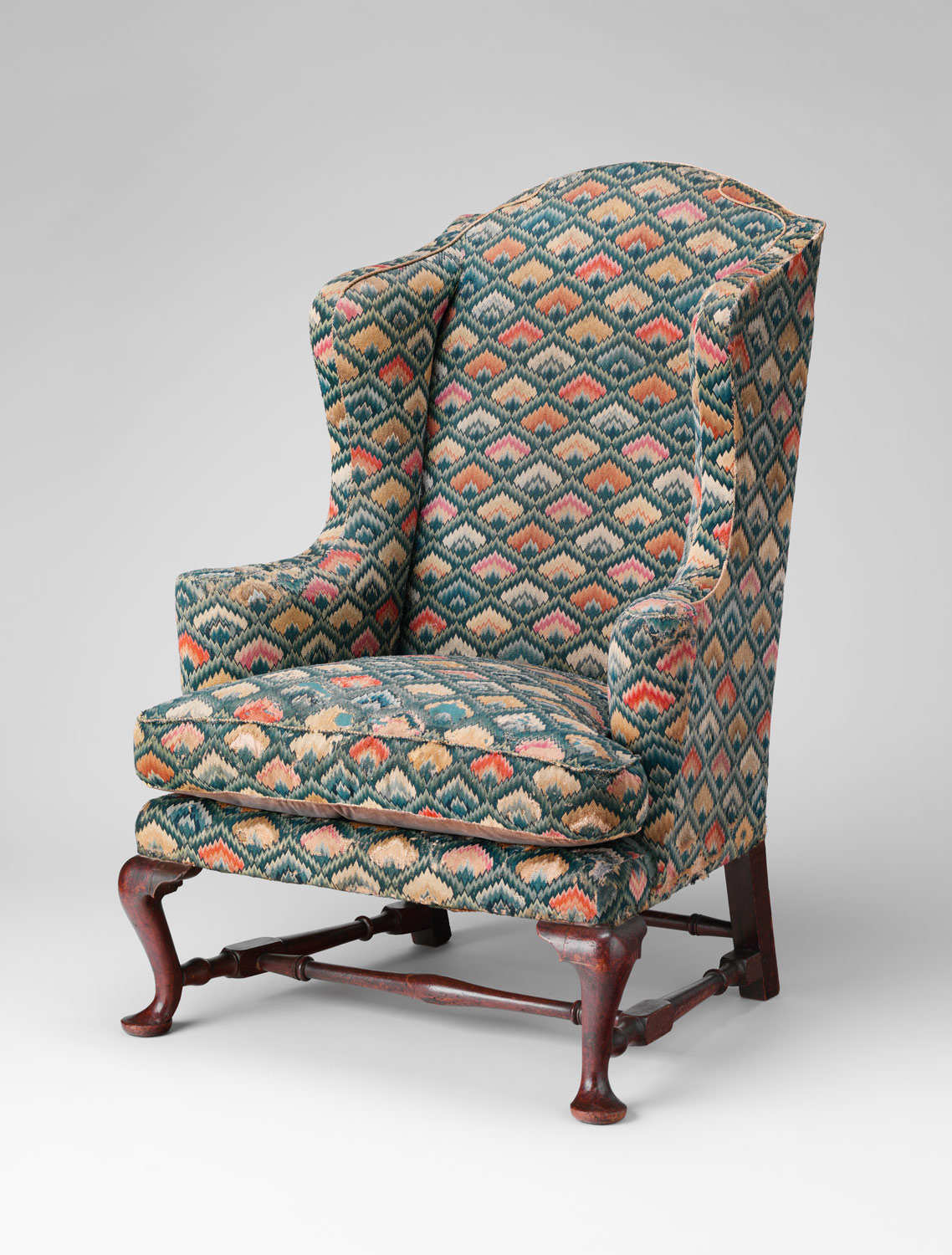
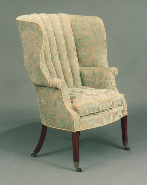
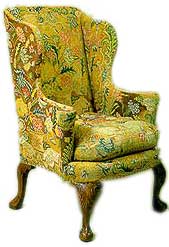
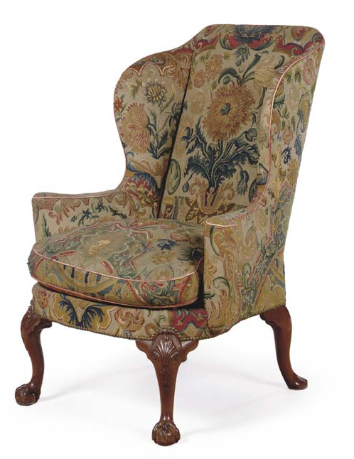
I purchased a really fun chair–an 18th century George III wingback with exaggerated wings. The curves of the wings, seen from any angle, really makes this a wonderful chair.  So now my project is–what fabric do I select?   I could use it in 3 different living/family rooms.  Colors that would go are likely to be a neutral cream/tan, blue, or red..  The 3 rooms could be one that has a country french yellow toile drape in it, a family room with brown la declaration drapes, and a living room with a coral sofa, blue would be great in there.

Finding an old chair made me wonder what it may have been upholstered with originally.  After hunting around, I found a reference Judith Miller made in one of her antique guides.  She says that originally these chairs were upholstered in grospoint or petitpont needlepoint.

So I started my hunt for pictures of what a wingback chair from the 1700’s would have looked like.  There’s a website called Furniturestyles.com that had this example. (See link below to read more)

Wing Back Chair
Furniturestyles.com

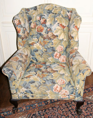
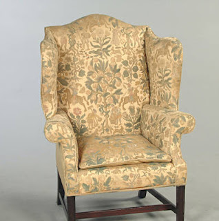
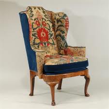
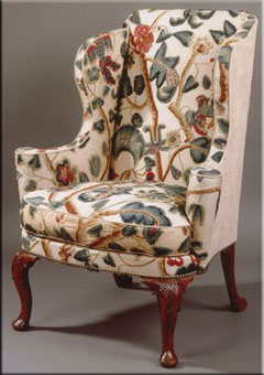
This beauty is on Ist Dibs – (click on the link to view ad.).  Interesting floral pattern.  Sort of a Jacobean influence?

Ist Dibs Chair $18,000

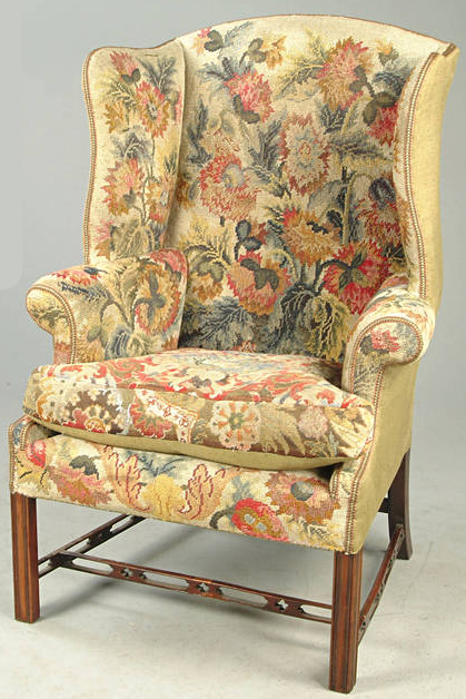
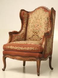
Another wonderful example with large bold flowers:

George II Walnut Chair, circa 1730.  Christies
More of those wonderful bold flowers.

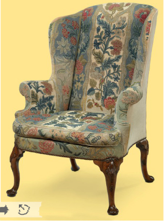
I went to my favorite website for pictures, Liveauctioneers (yes I got permission, ok to use if I put in a link), and found this –and subsequently went to the Bonhams website.  Again, a lovely floral needlepoint.

Fantastic chair from a Bonhams auction – photo Liveauctioneers.com

So I checked out a few English antique websites and found more floral needlepoints.  I’m assuming that the backs may be replaced?

Wakelin-Linfield Antiques had this chair.  They said it is a George I period chair with most of it’s original needlepoint
A 1750’s chair with later 1800’s needlepoint.
Notice the background color is different from the other examples.
Not liking that.  At auction.

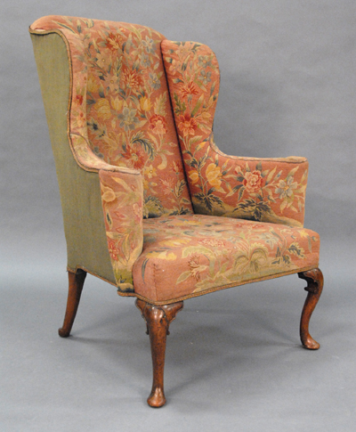
A GEORGE I WALNUT AND NEEDLEWORK-COVERED 

WING ARMCHAIR CIRCA 1715 – ($62,500) Christies.

Hmm.  An interesting departure from the other florals.

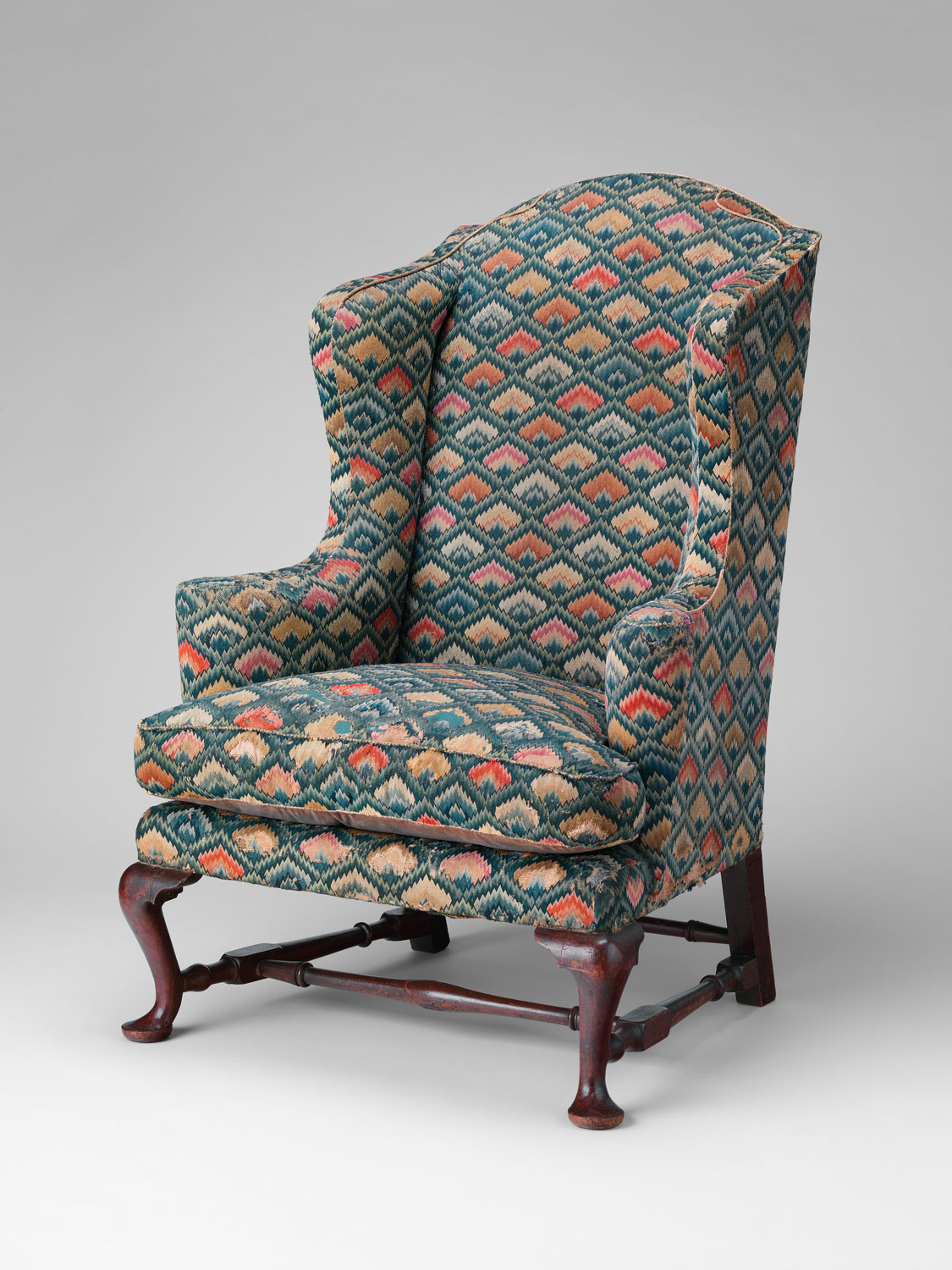
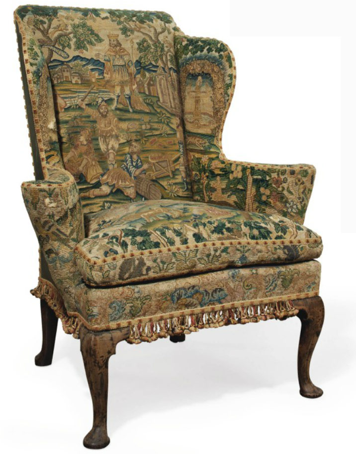
I thought that I’d check out what museums have, and found this at the Metropolitan Museum of Art. — An American chair.  I totally love this back.  The front is interesting, a geometric patten.  Date:  1758.  I find that fascinating.

Fantastic needlepoint on the back of a chair, dated Newport 1758
at the Metropolitan Museum of Art. 
Front of 1758 Chair at the Metropolitan Museum of Art
The back reminds me of a needlepoint sofa-back – I’d just love having something like this.  Don’t you just love this.
Here’s another to die for chair with a price tag equivalent to a few houses in Iowa:
Christies Auction Nov 2010 Sold for $113,000

From the Christies catalog:

A GEORGE I WALNUT WING ARMCHAIR 
CIRCA 1720 
With associated gros and petit point needlework, the back with a panel depicting a maiden by a well, surrounded by trailing foliage and flowers, the sides and back with plain cotton, on shell carved cabriole legs with pad feet and leather castors, some reworking to the needlework, the back seat-rail replaced, restorations to the ears of back legs

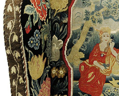
Check out the detailed stitching.
Below:

A GEORGE I WALNUT WING ARMCHAIR 
CIRCA 1720 
Upholstered in associated 18th century close-nailed gros and petit-point floral needlework, the back and seat depicting classical figures, on cabriole legs with pad feet

Christies Auction Nov 2010 $55,000
Here’s one in an upcoming auction.  I have to say this is what I think most motifs are, although most of what you see is floral, I suspect that many I see in my price range (ok, not in my range, but ones I am able to see) may be later than 18th century.
Christies Nov 2011 Auction
A GEORGE II MAHOGANY WING ARMCHAIR 

MID 18TH CENTURY 
With associated 18th century figural needlework covering, the back legs later and oak…


ANYONE READING want to buy me a christmas present? !!
Judith Miller said most of the antique chairs would be figural or I assume she meant like these scenic.  I do love the huge flowers.  Given the age of these pieces, can you imagine how bright the chairs really were?  If you think about the times, I’d like to sit by the fire, curtains pulled, dark rooms, most likely, to stay warm in the winter.  A bright color would be needed, don’t you think?
So now that I’ve seen all these fabulous examples, needlepoint that is only 100 years old just doesn’t have the same look: 
This French chair with needlepoint looks like a later design.
It is circa 1900 from http://www.oldplank.com
So how has the design community reacted to wonderful old needlepoints and tapestries?  We get stuff like this. YUK in my book after seing so many wonderful antique pieces.   

From Liveauctioneers.  Don’t do this fabric.
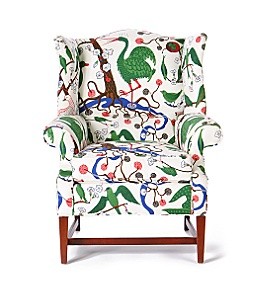
There is another option:  Crewel fabric.  The chair below is probably the type of crewel that is available.
Chair from auction, probably not antique.
If you decide to go crewel, set the bar high.  Using a colorful crewel is definitely the way to go.  Often times the crewel is only used on the inside of the wing chair–I assume to save money as you can spend upwards of $500/yard for some of this stuff.
http://pontysporch.blogspot.com
Read her fun article on wingbacks.
I spotted this on Ebay, one of my favorite dealers who carries textiles has this in her house:  She is spot on, having found a wonderful tree-of -life crewel fabric.  Don’t you just love how the pattern fits on this chair?  Wonderful!  I would love to find something like this for my chair!
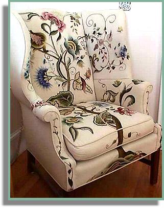
from a favorite eBay dealer:  rivervalleytextiles.  Click here to read her bio, and read about this project.  (Check out her listings, she has the prettiest pictures.  Plus  she gives you great tips on care and collecting of textiles.)

Chelsea textiles makes a dynamite option  $510/yard wholesale. 
Ochre with flower & fern
OK, so I don’t have any connections to get crewel on the cheap, haha.  So what other fabrics are an option?
After checking out all those wonderful English chairs, I thought I should check out what you see on American chairs.   I immediately thought of Colonial Homes, and how you saw two things:  plaids or damasks.  Talk about two extremes.  Both are really strong statements, I think…  Here are two plaid examples:
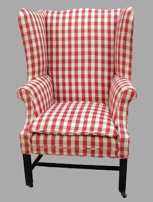
This is actually more historically correct–most of the chairs did not have a cushion, and if it did,
it was a thin cushion.
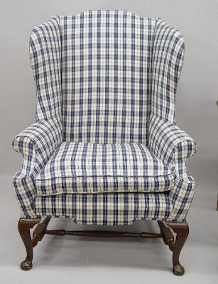
Another example of a blue plaid chair.
Probably more historically correct – no bottom cushion, according to other reading.
Then I read that they sat on plump pillows.  HMMM,  this is confusing.  What do you think?.

(FLAT CUSHION DIVERSION)  Here’s another chair with that flat cushion.

This chair is interesting–it has the flat cushion.  The photo is a bit blurry–
I can’t really tell if it is a tapestry or chinoiserie fabric.  Bonhams auction  
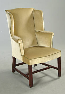
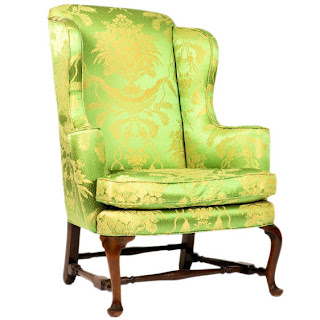
So I checked out alot of photos on historic wingbacks in the U.S.  There are alot of beautiful chairs at Winterthur, the White House, and Blair House –it seems as though damask is what is used on these expensive chairs.  I looked around on the internet, and found these beautiful chairs.
Interesting UK website 
Isn’t the chair above really awesome looking?   I think the yellow fabric really looks the best, but I am pretty gutless when it comes to using yellow.  Coral would work better for me than yellow.
The same website has all kinds of interesting wingbacks.  I thought it would give me a good visual of what a pattern damask would look like.  
Interesting channel back.  I like the soft colors.  Cut velvet is something that is actually “antique”.  
Of course if I do cut velvet, only $500/yard (guess) Lee Jofa will do.
Le Notre from Lee Jofa
But what if it winds up looking like grandma’s velvet from the 60’s?  OK, back to damasks.
Killer green chair.  But how would it look in a room? I really love many shades of green,
but this one I think would whack me over the head when I walked into a room.
Ist Dibs
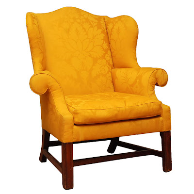
I actually love this bright chair.  Great pattern.  I think the damask pattern needs to dominate the back, don’t you?
These chairs are so big, it needs a big pattern.
Ist Dibs
I thought about blue.  This one is too baby blue, I’m thinking an indigo blue.  However, I am showing this one because I like the large cartouche on the chair back, works for me.
Or you could go conservative cream:
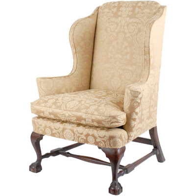
A fabulous period chair.  Very formal.
Ist Dibs
Of course, my version would be less pricey than $30,000
liveauctioneers
OK, another rule, give up the arm covers.  I have never liked them.   No, I don’t care if the chair gets dirty.   The big problem with damask is that the “authentic” looking stuff is silk.  I am way past doing chairs in silk, unless they’re a little chair that I’m just going to look at, and never sit on. (had to qualify that)
For those who were looking for wingbacks, and got stuck reading my blog, I’ll throw in some current chairs on the market, that aren’t museum repros breaking the bank:
Hollyhock has this one:
I don’t think I’m in a “busy pattern” mood.   Could be fun in the right room.  
Jacobean fabric.  I always like the free flowing vines on Jacobean fabrics.
  Chair on http://assemblageltd.com

Below is one from Anthropologie.  It made me think, toile!
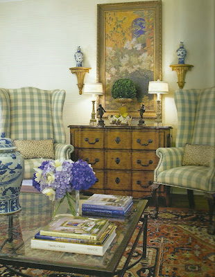
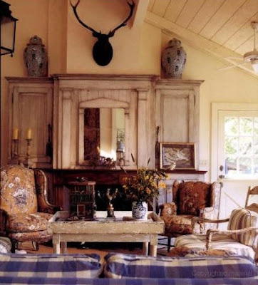
So of course I had to grab a Charles Faudree book and see what he likes.  
Plaid -hmmm.  Country French?  or too early American?  
Pierre Frey Petit Parc fabric.  A nice rich bold color.
Look no further than the front cover of Charles Faudree’s book.
I think this is a Groves Bros fabric.  I sent away for samples.
I don’t really like all toiles.  I’m not really liking the chair below, I don’t know why it seems flat to me.
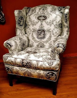
apartmenttherapy.com

Red or blue would work very well as an option for my chair.  This pattern below is lovely, very Fortuny-like.
A nice large pattern works best on such a large chair–don’t go for a wimpy cartouche!
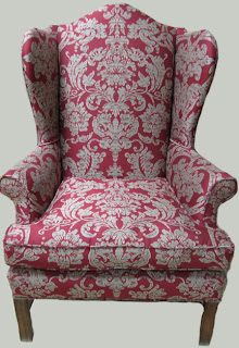
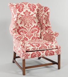
Not sure if I like the look…………..
Bright red pattern. The larger the pattern, the better.
Aspire Auctions

I do like this red pattern better………….

So what would you do.  My chair is like the one above.  I’m getting fabric samples.   Stay tuned.  Feel free to chime in on opinions.   I’m just so paranoid after the 80’s and people putting huge floral patterns on everything…but I don’t want plain linen, don’t want country check, don’t think I want velvet, saving that for the moss green upholstery job on the sofa.  I wish there was something out there that has the feel of the fabulous old needlepoints, but it doesn’t seem to exist.  I would love that!

What would you pick?

Follow:

From the Shop

I may earn a small commission if you purchase with these links

Caning Natural Tote Handbag - Universal Thread™
The Hustler High Waist Fray Hem Ankle Bootcut Jeans
Le Panier Pliage Raffia Crossbody Bag
Extra Large Le Pliage Panier Tresse Straw Tote
The Bennet Buttondown Shirt by Maeve
T Monogram Perforated Leather Bucket Bag
Mellow Stud Mule
Le Pliage Marinière Recycled Nylon Canvas Travel Bag
Unseen Sunscreen Broad Spectrum SPF 40 PA+++
Maxine Stripe Cotton Button-Up Shirt
Citizens of Humanity Charlotte High Rise Straight Jeans
Navy Equestrian Traversee M Linen Tote
Cream Carrie Blouse
Ellison Natural
Jolene High Rise Vintage Slim
Citizens of Humanity Blue Jolene Jeans
Charlotte High Rise Straight Jeans
Le Pliage Filet Top Handle Bag
Vintage cotton crewneck T-shirt
Air Heart Sunglasses
Le Pliage Torchon XS Top Handle Bag With Strap
Santorini Raffia Basket Bag
Chuck Taylor® All Star® Lift High Top Platform Sneaker
Please note that I use ShopSense, LIKETOKNOW.it, Shareasale and Amazon affiliate links on this site. This means using them for purchases won’t cost you extra but may earn me a small commission.  Our full disclosure is available for viewing under About in the disclosure policy.
All rights reserved. Our graphics, images and text are all subject to copyright protection.